Packaging design for a new range of organic gardening products selling across Europe.
Project Summary
SBM is an independent and family-owned France-based group of companies that develops, formulates and distributes ranges of crop and gardening solutions for professionals and consumers.
At the end of 2016, SBM bought Bayer’s range of garden products and brands, creating SBM Life Science. The two unities needed to be integrated, and a new brand strategy devised for the new consumer range of formerly Bayer and Solabiol branded products.
At each stage of the project I was really happy to have chosen Caroline and the team because they were a really good partner for the project. She managed to, at the same time, listen well to what we needed but offer the right level of challenge
The product range is very complex, involving 2,000 SKUs across all countries. And it’s a complex and very competitive marketplace; the point of sale environment differs vastly according to the individual laws and regulations in each county
Reach was engaged to work on this new strategy, and to redesign the brand and packaging for SBM Life Science’s ‘Solabiol’ pan-European range of natural organic gardening products, now being successfully sold in 6 countries.
The Backstory
Linda Coppola is the European Marketing Director of SBM Life Science. She wanted to work with a team that could help her create a new brand and visual identity for SBM’s organic gardening products. Reach was selected via a credentials pitch against a couple of larger European branding design agencies, winning on their flexible approach and strategic insight. Linda felt Reach’s smaller size would result in a more agile and responsive service.
Challenge
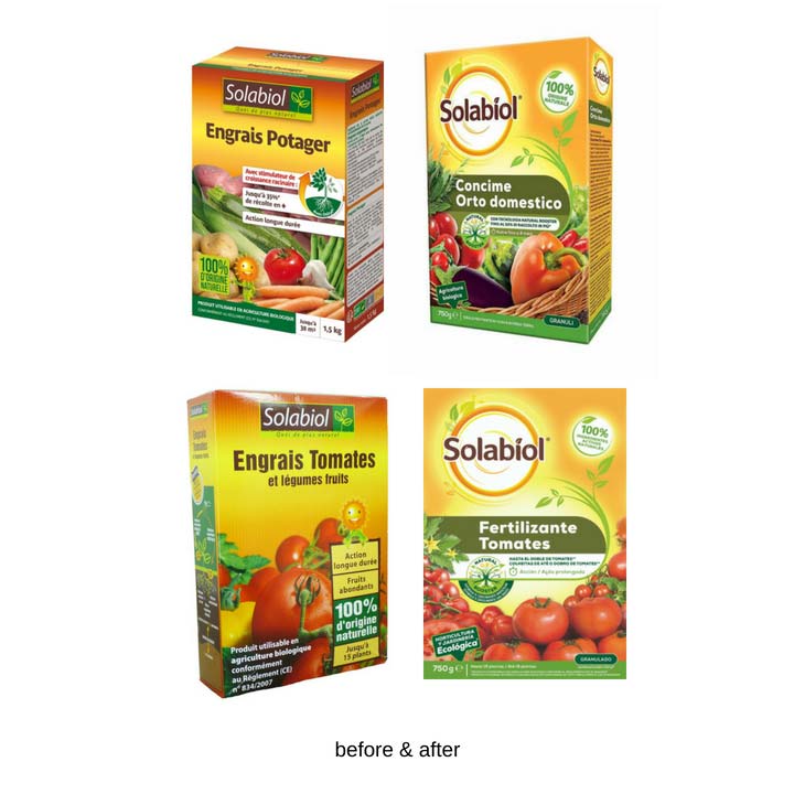
Solabiol had recently bought Bayer’s entire gardening franchise across Europe, meaning the whole of the Bayer range needed rebranding under Solabiol. Solabiol already had a strong natural/organic position in the French market, but was unknown in the rest of Europe. The task was therefore to create a new identity that could work across the existing Solabiol range of products and encompass all of the Bayer natural products in all the other European market.
There were several different challenges to the project:
- a very diverse range: There were over 2000 products in the range of products to be rebranded. Furthermore these are in 6 different languages and a myriad number of pack formats. So the new identity needed to be incredibly flexible and easy enough to be rolled out by the individual markets
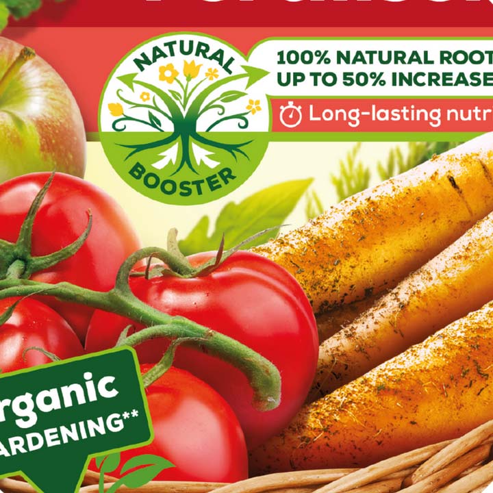
- an organic natural proposition that needed to engage emotionally and convince consumers of its efficacy
- our research in the 2 lead markets of Italy and Germany demonstrated that the consumer in each country has a very different emotional approach to gardening
- gaining buy in: there were several stakeholders, each with strong views: the owner, the senior management team and the key marketing & sales teams in the individual markets
How the project worked
Our solution was to create the visual strategy first, before tackling the complexity of the packaging design.
Hypothesis
We hypothesised the solutions to the various elements of the visual strategy and brought these to life visually:
- brand positioning
- level of evolution required of the Solabiol packaging identity
- colour palette
- style of photography/illustration
- hierarchy of communication
- range segmentation
Co-Creation workshop
We held a co-creation workshop with the senior management team, the owner and representatives of the key markets – France, Italy and Germany.
The conversations this generated enabled the client team to have discussions that help them reach a consensus and a vision for the project was set; facilitating future buy-in by the markets into later designs.
Research
We then conducted qualitative consumer research that gave us insight into:
- how the brand should be positioned to emotionally engage the consumer
- the shopper journey
- the hierarchy of communication
Design and deliverables
We were then all set to start on the packaging design. Once the design concepts were narrowed down from 3 to 2 routes, we used further qualitative research in France, Italy and Germany to inform our final design route and refine on pack communication.
Our final deliverables were:
- brand guidelines for roll out by 7 countries across 2,000 SKUs
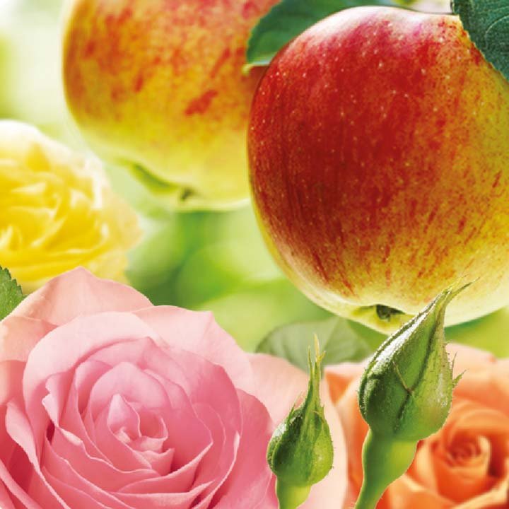
- photography of 100+ plants to create an image library
- print testing to ensure correct reprography in final print runs
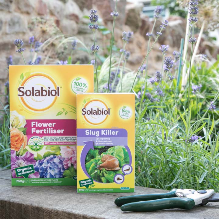
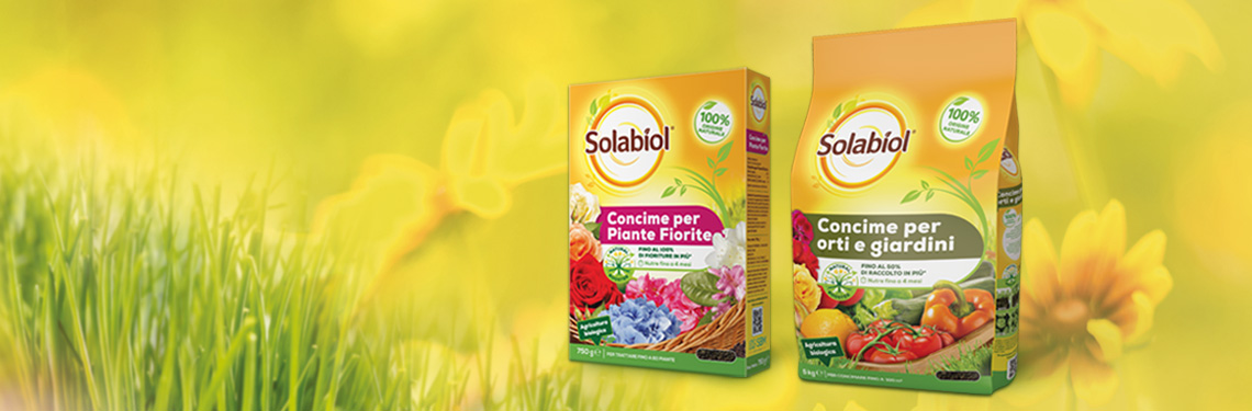
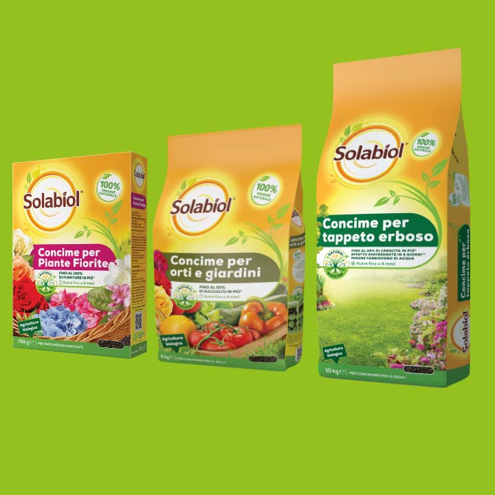
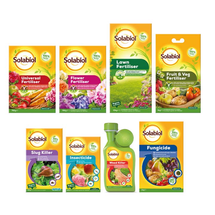
Finished design
The final design creates a strong, ownable and impactful brand identity; Solabiol now offers the consumer an emotional, sunny, powerful and harmonious vision for their garden.
There is clear differentiation between the range of fertilisers, with its abundance of growth breaking out and into the design and the range of insecticides, fungicides, etc that reassures efficient control of the problems in the garden and the resultant satisfaction of luscious growth.
The design has to be incredibly flexible to work across a variety of pack formats – different sizes, shapes and substrates.
Outcome
The identity rolls out across Europe in 2018 and 2019.
Learnings for complex brand design projects
Getting to a final signed off design on a project of this enormous size and scope can often be painful for both client and agency. The client frustrated that the agency isn’t listening to their feedback and the agency frustrate that the client is interfering with their design.
The approach we took with SBM team (and all our clients) is that the process of design is a democratic one and a continual stream of problems/challenges arising throughout a project that design has to solve.
We see the client’s feedback as a series of ideas or hypotheses that we as designers are best placed to try out to see if they can work. Equally, at every step of the way, we are trying out our own hypotheses on the design to see if they can work.