![]() By Caroline Hagen
By Caroline Hagen
When it comes to consumer-tempting, award-winning food packaging, what do you need to consider? We’d say appetite appeal, using every face of the pack, and making sure the pack format is helping not hindering. Read on to find out more about food packaging design with Reach – and how it can help your brand really stand out.
Appetite Appeal
Why does it matter?
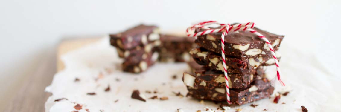
Whether your product’s ambient or fresh, a component part of a meal, a wet or dry ingredient, a snack, or a treat, it needs to look tasty: it’s going in your mouth after all. If you have a great product that can feature on pack which will help to differentiate on shelf, great. If you’re proud of your ingredients – they may be unusual or particularly healthy – show them. However, not all products or ingredients look appealing. In these cases, we recommend featuring your brand story, or strong attractive colours and typography to achieve a tasty looking pack.
Reach & Encona – food packaging design where history is hero
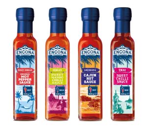
We persuaded the owners of Encona Sauces, Grace Foods, to shed a strongly held belief that it was critical to show a picture of a chilli on front of pack – a belief copycat competitors shared. Instead we created a compelling brand story on front of pack that reassured consumers that Encona is the most authentic Carribean hot pepper sauce around. The colours and imagery are more appetising than any rendition of a chilli pepper, as the results in the Encona case study prove.
Maximise every millimeter
Why does it matter?
Think it’s all about the front face of your pack? Think again. Of course, front of pack is critical for shelf standout and brand engagement, but the side of the pack is where you can really enrich the consumer’s experience. Embellish the brand story to engender loyalty, share useful serving suggestions, go to town here on how your product is made and shout out about the quality of ingredients and how they are sourced. All of this extra information draws in your consumer – and gives them more reasons to buy next time.
Reach & New Covent Garden – food packaging design that uses the whole pack
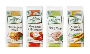 We created a new, distinctive tone of voice to help New Covent Garden to engage with consumers on the side of pack. Now they share stories about how to serve their soups, their inspiration for the recipe and explain how the ingredients were sourced. This all serves to enhance the brand’s values of creativity and naturalness. Brand loyalty scores increased from 49% to 51% – and our work was vindicated with a DBA design effectiveness award. New Covent Garden case study.
Consider pack format
Why does it matter?
Pack format is the shape or type of packaging your product is packaged in. And when consumers are scanning the aisles for a product or brand, pack format is how the shopper can quickly tell what your product is. At this stage of their purchase journey, consumers aren’t reading words on packs – they’re looking at shapes and colour. Of course, if you’re using the standard packaging for the product in question, it’s even more important for your packaging graphics to stand out and differentiate your brand and product from its competitors. That said, if you choose an unusual format for the category, it’s important to clearly state exactly what your product is so the shopper considers your product alongside your traditionally formatted competitors.
Reach & Rocombe – pack format in food packaging design
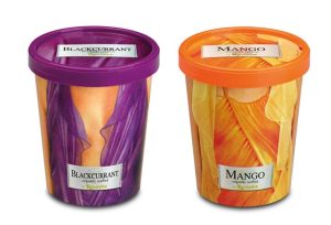
Rocombe ice cream had just been acquired by new owners, Yeo Valley Organic. Understandably, they wanted to charge a premium price for this stunning quality ice cream, so it was time for a packaging design update. The old packaging line was set up for the standard premium ice cream format – cardboard tub and lid – which aligned it with key competitors, Haagen Daaz and Ben & Jerry’s. Our challenge lay in setting it apart from the rest and getting the brand noticed. Our radical redesign featured beautifully tailored and stylish handmade clothing that subliminally communicated to consumers (and the upmarket deli trade) just how well made Rocombe ice cream is. We were rewarded with Gold and Grand Prix creative awards. And more importantly, Rocombe achieved a 15% price premium. Rocombe case study.