![]() By Caroline Hagen
By Caroline Hagen
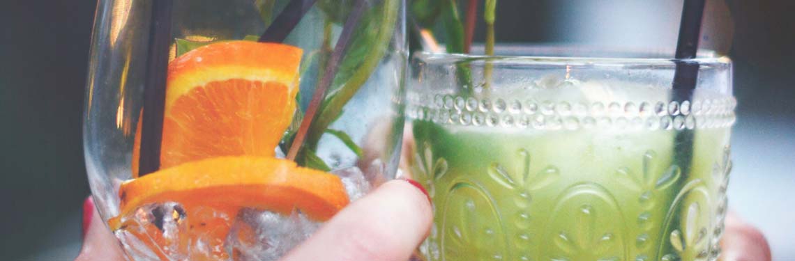
Whether you’re looking for soft drinks packaging to shout out alongside the sandwiches, or stunning bottle design to provide cut-through and quality in the adult beverages aisle, Reach has true pedigree. We’re familiar with – and passionate about – all areas of drinks packaging, and have delivered great successes for our clients through storytelling, ownable iconography and clever pack format customisation.
BE A STORYTELLER
Why it matters?
In the world of drinks packaging, it can be hard to offer a true point of difference. In fact, it’s often down to the brand to persuade the consumer to buy their product over the cheaper own label equivalent. Success can lie in creating a story that relates to your product’s qualities and helps it stand out alongside the cheaper own-brand options. We’ll work with you to create that story, and make sure that it supports premium pricing over own label products – and stands apart from competitor brands.
Reach & Johnsons – bursting with fresh appeal
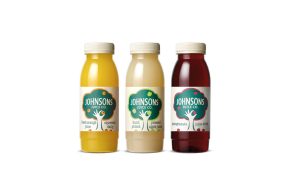
The Johnsons story didn’t focus on the usual suspects: heritage, people, or location. Their competitive advantage lay in the fact that they squeeze their oranges daily in the UK. We chose this focus because their key competitor Tropicana, who – contrary to popular belief! – squeeze their juice in Florida and ship it over frozen. The ‘squeezed daily’ story turned into an icon to cleverly connect the squeezing of the oranges with a hand-picked freshness. Our efforts rewarded our client Daniels with a long sought-after listing in Costa Coffee – purely as a result of the redesign. Johnsons Juice case study.
MAKE YOUR MARK WITH OWNABLE ICONOGRAPHY
Why it matters?
The vast majority of drinks are sold in similar bottles (PET or glass) or tetra paks, which makes catching your consumers’ eyes a big challenge. A strong, single-minded and unique icon can help your consumer spot your product amongst its myriad competitors. And when that instant recognisability is backed by a compelling brand story, you’re on to a winning drinks packaging design.
Reach & Koji – evocative, instantly recognisable iconography
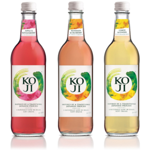
Koji’s startup owners had a big task on their hands to launch a new brand into an already vastly over-crowded market of soft drinks. A strong brand mark icon that represented their unique proposition of Japanese-inspired purity helped them gain instant on-shelf impact and recognition for their brand new range. When they came to sell the brand 3 years later, the instantly recognisable brand mark was an important driver for the sale. The new owners, Goodness Brands, have retained the Koji brand mark as an intrinsic part of the newly refreshed identity. Koji case study.
CONSIDER PACK FORMAT
Why it matters?
Given the the similarity of drinks containers and the ‘off the shelf’ formats that are available to all, using format to differentiate a drink can be challenging. However, Reach is always leading the field when it comes researching new trends and technologies in drinks packaging design. A great way to create stand-out is embellishment: embossing the bottle with your icon or logo; using a different print techniques like screen printing onto glass or shrink-sleeving; even special inks like neon and glitter.
Reach & Jim Beam – Ardmore’s eagle takes flight in glass
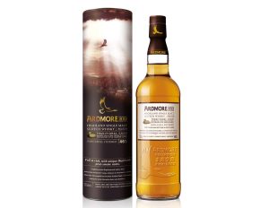
Jim Beam brands wanted to launch a new single malt whisky into an already crowded market. A unique story is essential for single malt but, but given the off-the-shelf format of the glass bottle and outer carton, embellished drinks packaging helped to create cut through. We’d already woven a golden eagle into our story and had created a brand identity and icon. So to really up the ante, we embossed the eagle on the glass of the bottle itself. This not only increased Ardmore’s ownership of the eagle; it also also enhanced the quality and feel of the whisky. Whisky aficionados obviously agreed, with sales on launch beating target by 25%. Ardmore case study.