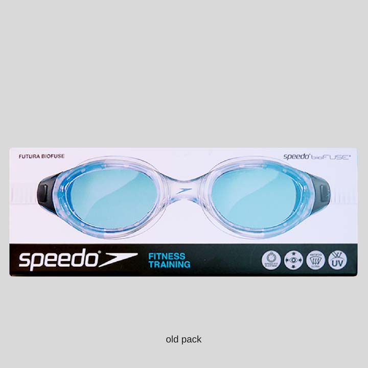
How we helped Speedo’s range go global
When swimming legend Speedo approached Reach to create a new global packaging design for their goggles range, we were thrilled. The challenge? Grab customers attention and encourage them to reappraise Speedo, while making it easy for them to find their perfect fit from a ‘good, better and best’ range. All on a global scale. Reach certainly delivered:
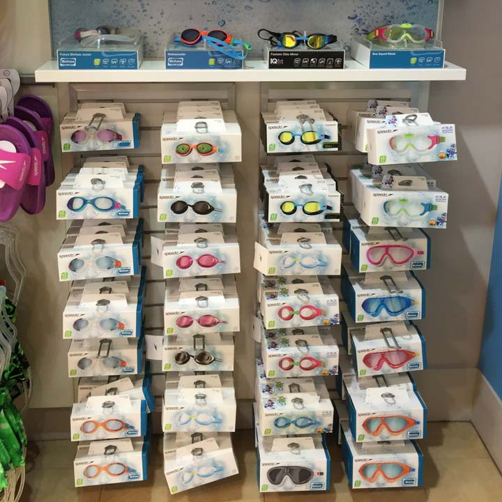
- 100 skus across 4 segments
- Launched in 10 global markets – including China
- Embodies an ownable consumer insight
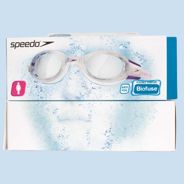
- Icons clearly communicate in non-English speaking markets
The key to successful packaging can often be uncovering an unmet consumer need that the brand is uniquely placed to fulfill. Creatives can focus on capturing this unique benefit on pack, whilst also communicating the functional benefits. It’s an ideal situation, where functional and emotional benefits work together to engage heads and hearts.
Consumer perspective
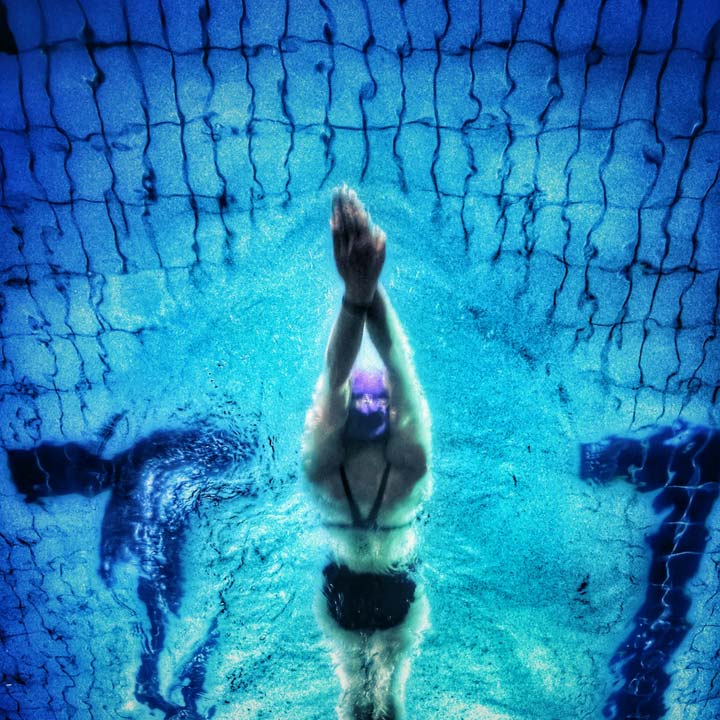
Swimmers who wear goggles fall into 3 broad types: leisure, health & fitness, or professional. Although swimming for very different reasons, the functional benefits are the same: you need goggles through which you can see clearly, that don’t fog up and that are comfortable. The more important swimming is to you, the more critical it is that your goggles work as hard as you do: seeing clearly, you feel at one with the water and have the freedom to perform at your best.
Reach approach
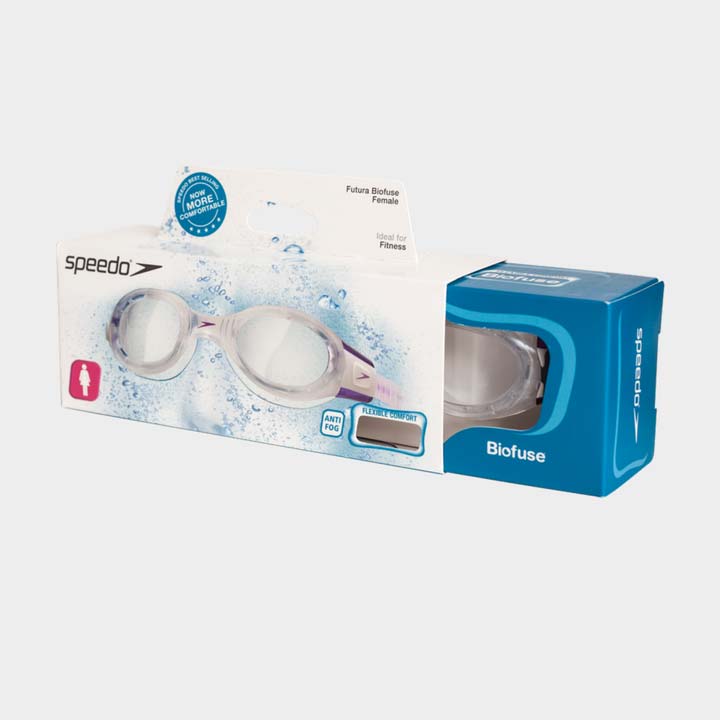
The quality and appeal of Speedo’s goggles range is fantastic but the packs needed emotional engagement. And more importantly, they needed to help communicate different quality tiers in the range and persuade consumers to trade up. There were several additional challenges to meet:
- Keep the design evolutionary – make sure it’s still recognisable to existing consumers
- Appeal to a diverse set of consumers in UK, Europe AND the Far East & China
- Communicate on front of pack using the minimum of words and mainly symbols
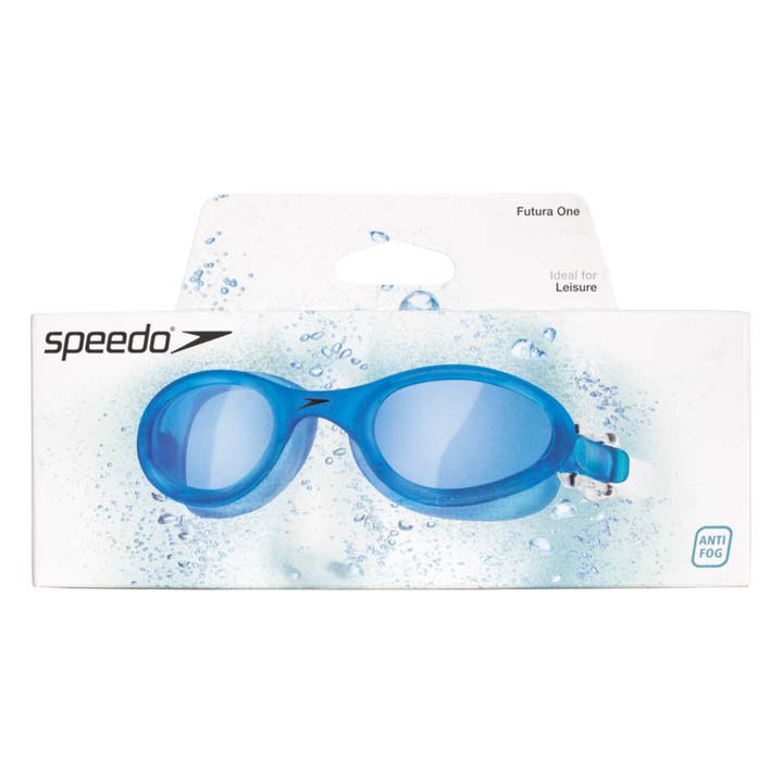
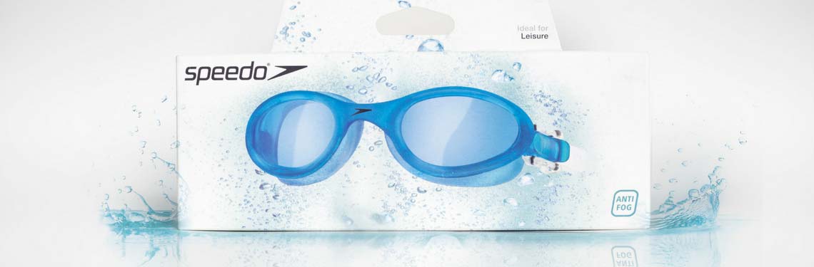
The front of pack imagery is now highly engaging, portraying the moment when a swimmer enters the water for the start of their swim; the feeling you get when you sink into the water and look ahead through crystal clear goggles.
It’s instant, engaging and now, 100% Speedo.
Secret to success?
The key to success was to work very closely with their insight team to create visual stimulus for our co-creation workshops. This lead to uncovering a global consumer benefit the brand was uniquely placed to own, based on Speedo’s emotional benefits.
Logistics saw us use English on front of pack, with the back of pack carrying foreign language translations. To improve global performance, we used symbols to communicate important facts and, when combined with the improvements we made to the structural packaging, persuades consumers of the benefits of trading up from good to better or better to best.
Reach delivers
The new packaging is now on sale all over the world, and has to communicate in retail environments as diverse as China, France and the USA, with only English as the front of pack language. Consumers are guided to the increase in quality through sub-brands and icons, as well as premium modifications to the pack structure.