Bronchostop Cough Medicine
Bronchostop, a pharmacy packaging design case study that’s as revolutionary in the category as the product is to consumers. The results speak volumes:
- Winner of the Pharmacy Product Launch of the Year
- Boots top ten launch
- £4.36m retail sales value in just five months – achieving over 10% of market share
What I love about Reach is that Caroline and her team prefer to be given issues rather than solutions, allowing their creativity to come up with the best possible design to fulfill our packaging needs.
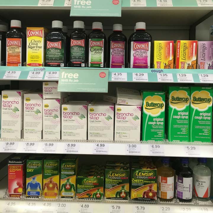
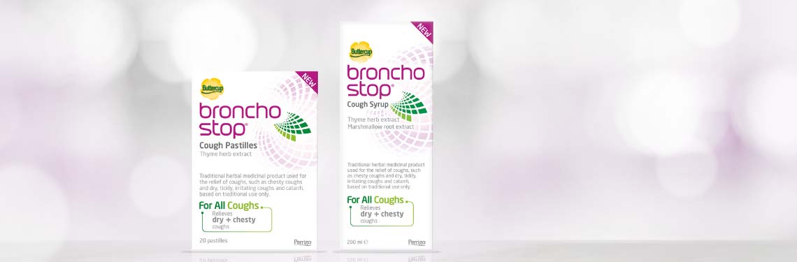
As a best-in-class example, many elements have contributed to the successful Bronchostop launch across Europe, the distinguishing and shopper-intuitive white packaging in a colourful cough shelf is certainly one of them.
Consumer perspective
Traditional herbal medicines packaging can be old fashioned and unattractive, while plant-only formulas can ‘turn off’ all but the most committed natural remedy consumer. By contrast, mainstream brands can look medicinal and harsh – so how did we convince both herbal believers and conventional converts to give this exciting new brand a try?
Reach approach
Using our co-creational approach to establish a visual strategy for the brand, we helped Bronchostop find a unique positioning in a sea of cough syrups and pastilles. Together we explored new ways of achieving visual cut through in pharmacy packaging design, empowering the client team to make decisions with us normally reserved for the agency strategy/creative team – a perfect example of Client Democracy at work. The resulting identity is revolutionary in the category, and epitomises the product: highly efficacious, scientific and modern, despite being a traditional herbal medicine.
My team and I really enjoy the active co-create sessions allowing all stakeholders to first truly understand the well-established category rules to see what works and what doesn’t to then determine all together how to make a real difference in that very same category – a difference to make our packaging more intuitive and thus easier for the end consumer.
Secret to success?
The key to the success of this pharmacy packaging design project lay in including the Omega Pharma team client in decisions on brand positioning, brand tonality, visual language and umbrella brand size. We enabled this by visualising the different options available, exploring together in a workshop with key decision makers.
Strategic direction agreed at every level, we were empowered with a creative brief that saw our packaging designers equipped to confidently break the visual rules of the category and define new ground.
Learnings for Pharmacy packaging design
By being brave enough to break the visual rules of a category – in this case, using an unusual colour combination of white and pink – you can create strong standout and recognition, especially in pharmacy packaging design.
The braver you are, the greater the risk… but the rewards are greater too.