How eurocentric packaging design really helped
Nature Valley is a popular cereal bar brand from the US-based General Mills stable. However, American food packaging design can jar when it lands on this side of the pond. Reach added a little European sophistication to help these scrumptious bars fly off the shelves.
The brand is growing in value share AND all consumer measures in ALL the markets where we play. From UK to Saudi Arabia, NV is considered a success and the packaging has been a key tool to achieve it in communicating the great taste of this wholesome snack
Consumer perspective
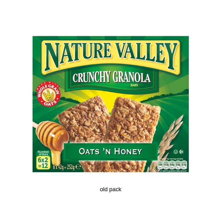
Cereal bars have rapidly increased in popularity. They’re now seen as a necessary complement to a healthy lifestyle – goodbye biscuits, hello cereal bars! The wholesome oats and honey Nature Valley is packed with should resonate with health-conscious time-poor consumers… but something wasn’t quite right. The problem? US food packaging design is a little more old fashioned than we’re used to here in Blighty, so despite enticing natural ingredients, Nature Valley’s US-centric look wasn’t cutting it. So General Mills came to Reach for help…
Reach approach
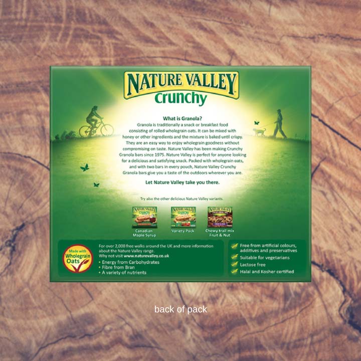
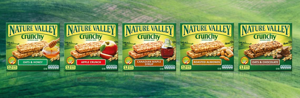
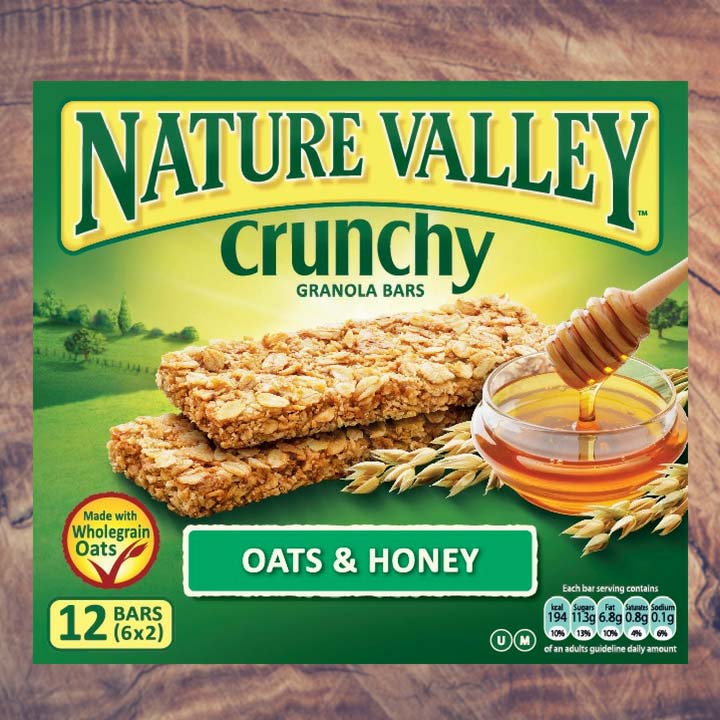
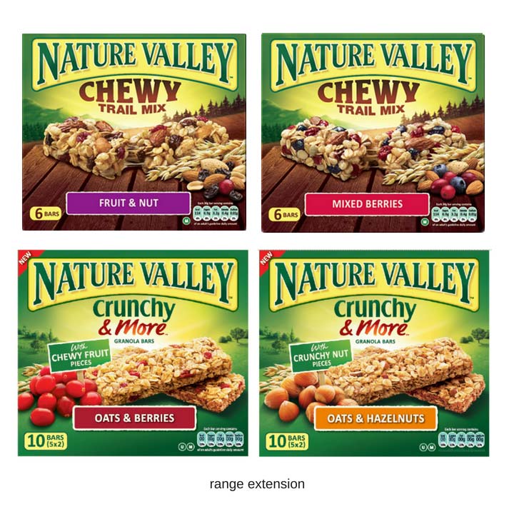
The old Nature Valley pack features a valley, a key visual element in consumers’ engagement with the brand. Though we didn’t change the brand’s logo, we completely uplifted the feel of the pack by evolving the valley graphic. It became a more romantic vista enticing and evocative of the great outdoors. And we built on this ‘great outdoors’ idea on the back of pack, suggesting an association with healthy activities such as walking, cycling and running. Photography was updated, ingredients heroed, and the typographical hierarchy tweaked: the US-centric term granola took a back seat, while taste-bud whetting ‘crunchy’ and ‘chewy’ come to the fore.
Secret to success?
Making decisions in our client co-creation workshop was fundamental in driving a smooth running project. We helped the the General Mills team decide how to depict the valley; whether to evolve the logo; how to present the product and ingredients; the language to use. All of this was decided before we got to the concept design phase, so the designers could focus on creating a beautiful magical pack to best engage consumers, instead of questioning how big to make the logo!
Reach delivers
In quantitative research, the new pack has performed strongly. The percentage of people agreeing with the following statements increased:
- ‘Wanting to try’ from 27% to 39%
- ‘Attractive’ from 23% to 35%
- ‘Healthy’ from 57% to 65%
- ‘Quality’ from 35% to 47%
- ‘Appetising’ from 28% to 40%