How a story catalysed brand performance
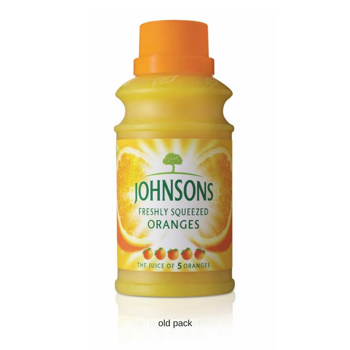
Johnsons juice has been squeezing juices in Kent since 1986, and while they’ve been successful, the landscape they existed in on shelf had changed radically. The launch of innocent in 1999 led to a flood of handcrafted personality-led brands – serious competition. Though Johnsons is a fantastic product, it needed a new look to showcase its freshly-squeezed story.
We helped this established brand take back a big bite of market share, achieving a 10% increase in sales.
The national profile and consumer exposure the new Costa listing gave the brand was massive, it gave the brand exactly the platform it needed from which to build sales.
Consumer perspective
When do you pick up a freshly squeezed juice? With a takeaway lunch, of course! That’s why Johnsons is typically found in cafes and sandwich bars. But the market has become much more competitive, with more artisan, hand-pressed producers – which is fantastic news for us as consumers. But in the seconds between picking a sandwich or a salad, how can a brand stand out? In the past, soft drinks packaging design would be more about look than content. These days though, story comes to the fore: consumers ask questions, and successful brands are those we believe in and engage with.
Reach approach
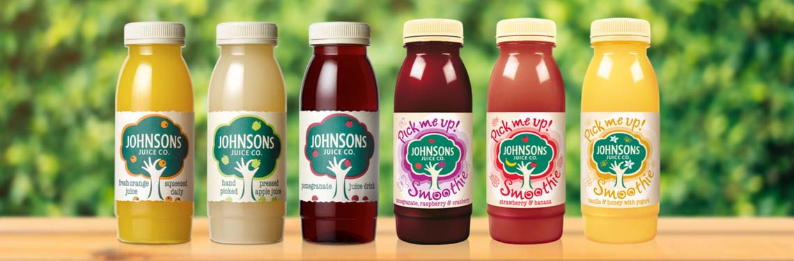
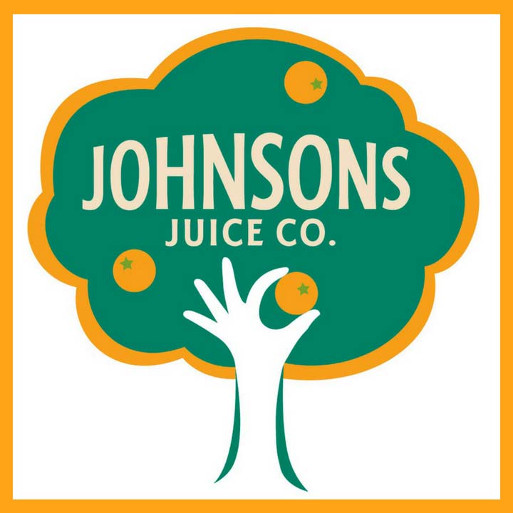
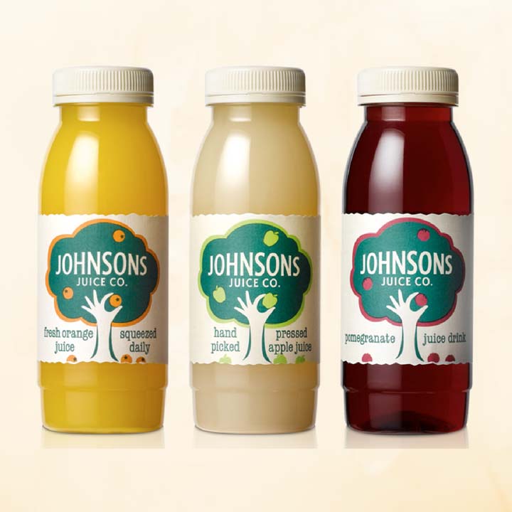
We set out to share the story of this small-but-passionate producer from Kent, where fruit is selected by hand to make sure only the freshest and juiciest are picked. It’s a simple, compelling truth: the juice tastes so fresh because it is squeezed daily here in the UK. This comes across in a new contemporary brand identity and packaging design, that retains the existing logo. Now, the logo sits in a holding device of a tree, giving it greater prominence and status.
The idea of the person squeezing the fruit on the tree to see if it’s ripe and juicy (and turning this into an icon for the brand) conveys the idea of real people being involved in the selection of the oranges for squeezing. What’s more our tree looks fresh and real, implying the juice is fresh – unlike imported or diluted competitor products. The colour palette is muted and we selected a rough made finish paper to convey naturalness and a handmade feel.
Reach delivers
The brand’s strong claims – ’freshly squeezed daily’, and ‘UK-made’ – have been leveraged to form a compelling and unique brand identity. The new-look packaging design didn’t just catch customers’ eyes – the buyers at Costa Coffee listed the brand within weeks. This in turn gave Starbucks and other national food service chains the confidence to list the brand, leading to a strong upward sales curve.
Secret to success?
Sometimes great drinks packaging design is about much more than design. In this case, we worked with parent group Hain Daniels to step back and reconsider their market positioning. By exploring the competitors offerings in a co-creation session, it became clear that Johnsons needed more than a new look and feel; it needed to bring its story to the fore too. And working together, we turned their key points of difference into an emotionally engaging market positioning.