Jungle Formula Insect Repellent for Omega Pharma
The brief
The brand had not been touched for some time and was thought to have not kept up with the times by consumers.
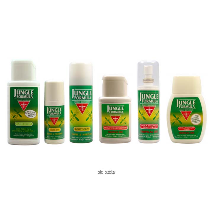
Also the dynamics of the insect repellent category had radically changed from a one strength fits all offering to the introduction of different strength, dispensing formats and usage formulations, resulting in fixtures becoming more difficult to navigate and make purchase decisions.
Within this Jungle Formula was perceived to be only for harsh and more extreme environments.
The consumer informed approach that Reach adopt really helped the process and informed the brief such that design development was quick and easy. It also made the internal sign off much easier. Reach are great to work with and answered the brief – what more could I want.
Results
- Ex-factory sales up 26%
- Increased listings across the portfolio
Learnings for brand evolution projects
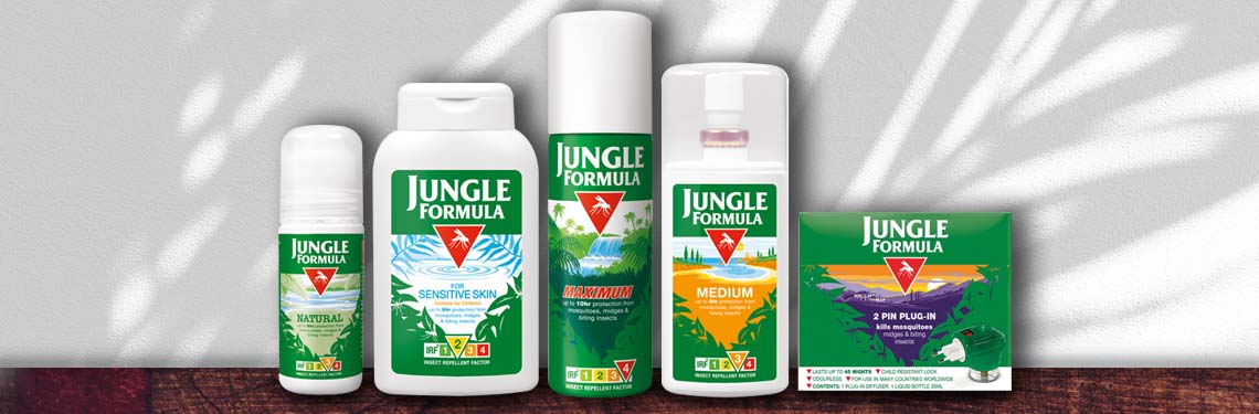
For Jungle Formula, agreeing that the equities were the logo, the red triangle and a visual ‘v’, left us with plenty of room to create a more visually engaging pack design.