Brand extension of a European pharmaceutical brand
Project Summary
Perrigo are a pan European pharmaceutical business which owns many well-known brands; XLS Medical, a weight loss brand, is one of their most successful.
As with any successful brand, consumers and the trade alike are hungry for new products; meal replacement shakes were therefore a natural product for the brand to launch, being on trend as well as a great brand fit.
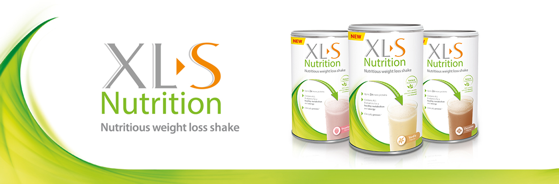
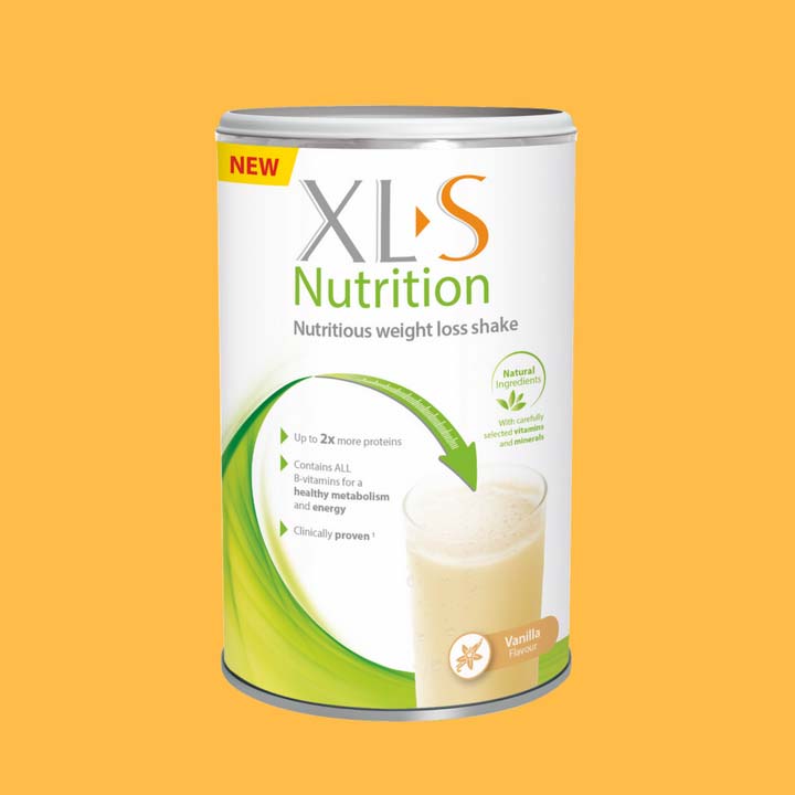
Reach extended the XLS Medical brand to create the XLS Nutrition sub-brand and the packaging design for the range of new products.
Reach is one of our preferred partners to work with when it comes to packaging design. Caroline and her team truly understand the crucial role packaging plays in today’s environment when it comes to catching the shopper’s attention.
The back story
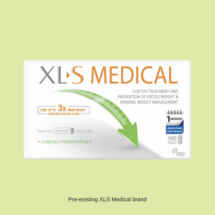
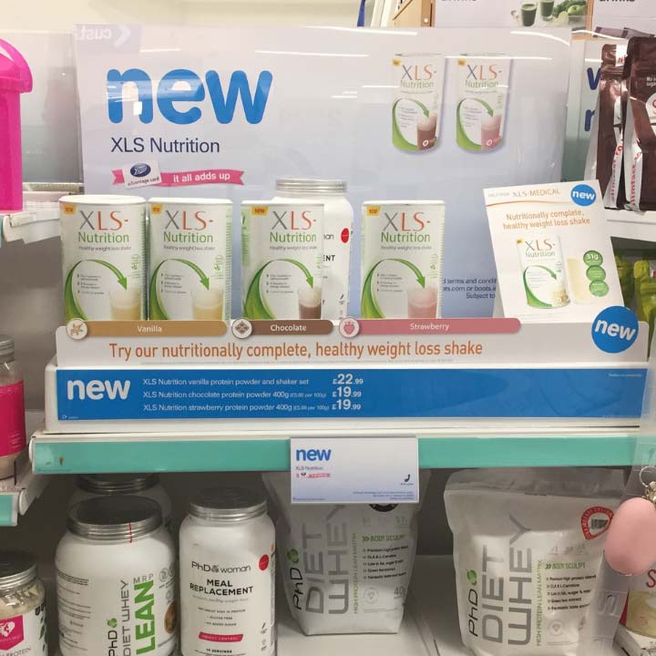
The XLS Medical brand is well loved by consumers and has strong brand recognition. Up until now the brand had only offered tablets that help users lose weight, leaving the consumer to manage their own diet.
Consumers were already using meal replacement shakes as part of their diet so it made sense to offer them an XLS branded option so that they can buy all their weight loss products under the same brand.
Challenge
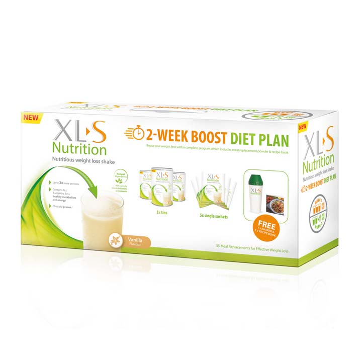
XLS Medical, as the name suggests, is a medicine and it looks like a medicine. Designing a food range under a medical brand, means carefully balancing cold medical efficacy visual cues with warmer food cues. Furthermore the XLS Nutrition products needed to look natural as they are all naturally sourced.
How the project worked
Having already designed Yokebe weight loss shakes for Perrigo, we knew the UK category well, so we updated our knowledge with an audit of the Belgian pharmacy environment.
This enabled us to define the visual language for the new sub-brand and agree this upfront with the client before we started designing.
As part of our Client Democracy approach, we also explored upfront how much to use elements of the visual equities of the XLS Medical brand such as the arrow and the green, grey, orange colour palette as well as various options for new logo.
This meant we had a clear idea of the visual strategy for the new sub brand before embarking on concept design.
Outcome
The final brand design combines a new scientific looking plant-based visual with the XLS trademark arrow to create a distinctive and iconic pack for maximum shelf impact and to provide reassurance of efficacy through the recall of the XLS Medical brand.
Appetite appeal comes from the bubbles in the glass and the condensation, without compromising efficacy.
Learning for Pan European brand extension
When tackling brand extension projects, you need to achieve a careful balance of the expected visual cues of the new category with the master brand visual equities. It always pays off to establish what these are with the client early on; that way you avoid many rounds of unnecessary design development later on in the project.