
![]() By Caroline Hagen
By Caroline Hagen
Making a change to your brand identity and packaging is risky; deciding whether to go for evolutionary or revolutionary packaging redesign is tricky. Get it right and you retain the loyalty of your existing consumer base and attract a whole new tranche of consumers. Get it wrong and a packaging change can lose you both consumer loyalty and sales, resulting in a drastic negative effect on your bottom line.
There are three common catalysts that lead to brands considering a change of packaging design.
- Market evolution. The marketplace has evolved, so your brand’s visual identity looks dated or less distinctive
- Consumer disenchantment. Your consumer base has fallen out of love with your brand and is being lured away by sparkly new competitor brands
- Opportunity knocks. Someone in the marketing team spots a brand in your company’s portfolio that has been neglected for too many years and whose time has come to shine
In each instance the big question to ask is are we looking for evolutionary or revolutionary change?
Evolution or Revolution – which is riskier?
The stakes are high when any change is made, but which is the riskier strategy??
An evolutionary strategy is one whereby the consumer won’t notice the change but somehow the brand just feels more relevant and they continue to feel good about why they buy the brand in question. The identity is gently nudged into the current zeitgeist of the category, key visual equities are retained and the result is a more modern pack design.
This strategy is appropriate for a brand with a large consumer base whose values and market positioning are still current and do not need updating but whose brand and packaging identity are looking out of kilter with a marketplace that has moved on. This might be because of new entrants to the category who are challenging the visual conventions of the category or simply that the visual identity looks old-fashioned.
A revolutionary strategy signals big change to the consumer, it can cause a lapsing consumer to reappraise the brand and, more vitally, it can start to attract and appeal to a whole new set of consumers. It can enable a brand to act as a disruptor (if a competitor has come along to take the high ground in the category) or to regain category leadership by confidently redefining the visual cues of the category.
It can be used when a brand has little recognisable visual equity with the consumer. This happens when a brand is slavishly following the standard category visual cues that all the other brands in the category employ, meaning it doesn’t stand out and differentiate itself within the category. Or when the identity is looking so tired and out of date it needs a completely new set of clothes in order to be appropriate and relevant in the category.
Health Warning!!! In either case, it is vital to understand what, if any, are the critical visual equities the brand should retain. Without this understanding, you risk losing a large part of your consumer base who will no longer find you on shelf or, if they do find you, may not like what they find!
Evolutionary change for Nature Valley
A useful evolution case study to consider is our redesign of Nature Valley granola bars. Can you spot the difference between the old pack on the left and the new pack on the right?
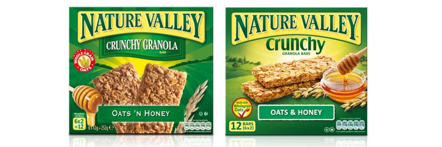 Nature Valley is a popular cereal bar brand from the US-based General Mills stable. However, American food package design can jar when it lands on this side of the pond. So we added a little European sophistication to help these scrumptious bars fly off the shelves.
Cereal bars have rapidly increased in popularity. They’re now seen as a necessary complement to a healthy lifestyle. Nature Valley is packed with wholesome oats and honey which should have resonated with health-conscious time-poor consumers… but something wasn’t quite right. The problem? US food packaging design is a little more old fashioned than consumers are used to in Europe, so despite enticing natural ingredients, Nature Valley’s US-centric look wasn’t cutting it.
The old Nature Valley pack features a valley, a key visual element in consumers’ engagement with the brand. Though we didn’t change the brand’s logo, we completely uplifted the feel of the pack by evolving the valley graphic. It became a more romantic vista enticing and evocative of the great outdoors. Photography was updated and ingredients were made hero.
Quantitative research backed an evolutionary approach
Even though the update is subtle, the new design was researched to ensure the brand’s appeal was enhanced and consumers still recognised ‘their’ brand and also to explore whether new consumers who had previously rejected this old fashioned looking brand, could now be persuaded to try it. The new pack performed strongly in quantitative research. The percentage of people agreeing with the following statements increased as follows:
- ‘Wanting to try’ from 27% to 39%
- ‘Attractive’ from 23% to 35%
- ‘Healthy’ from 57% to 65%
- ‘Quality’ from 35% to 47%
- ‘Appetising’ from 28% to 40%
These results gave the brand team the confidence to go full steam ahead to launch the updated design across Europe knowing they would keep their loyal consumer base and also reach a new group of consumers.
Revolutionary change in action at BP
Revolutionary change, by its very nature, is a riskier business but one where the rewards can be high, however, if you get it wrong, you could be facing big losses to the bottom line, as consumers abandon the brand they once loved.
Transforming a brand and its packaging is an appropriate strategy for a big brand that needs to signal big change. Remember when BP desperately needed to inject environmental values into its brand? Or a smaller brand that has little to lose by choosing cut through and relevance over maintaining recognition by a small consumer base.
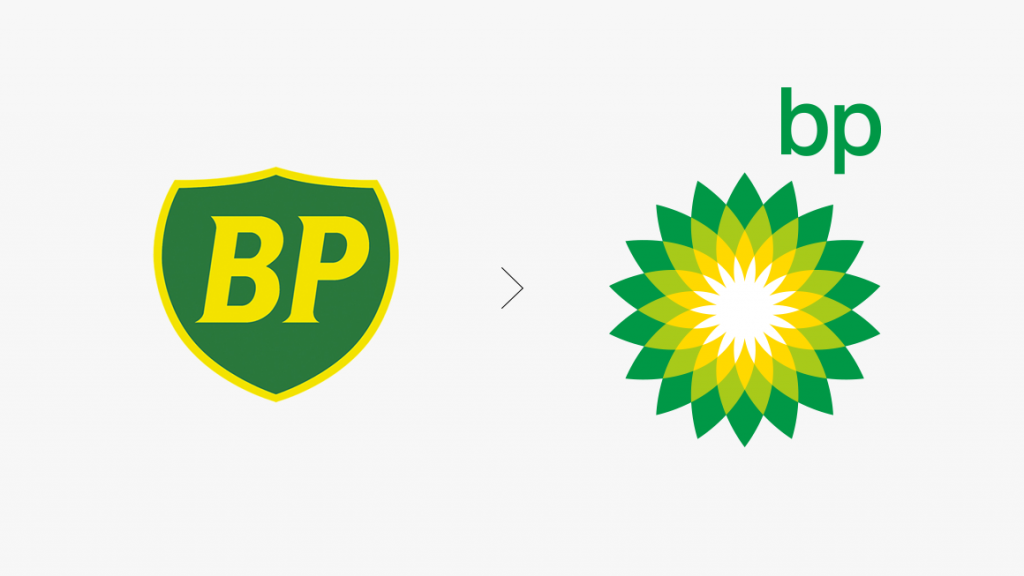
Image: Landor
When Landor so radically redesigned the BP identity, they retained the core distinct visual equity of green and yellow, thus signalling continuity. However, the new identity has a fresher, brighter outlook, with the flower pattern referencing nature and new life and enabling the brand to more credibly take a more environmentally responsible outlook.
Revolutionary change for Johnson’s Juice
Here’s an example of a successful transformational redesign of a brand; our case study of the redesign of Johnson’s Juice. There is little similarity between the old pack on the left and the new pack on the right. The name is the same and they both feature a green tree but the similarity ends there. So what prompted this brave decision to ‘throw out’ the old identity?

The Johnsons juice brand had been around for years but sales were languishing. New entrants to the juice market, such as the iconic Innocent brand, were stealing market share by challenging the usual design conventions of the category. Their hand-drawn brand identity was only about the brand’s values with no sign of a photograph of fruit to be seen.

Whereas Johnsons’ old identity was all about the product and not about the brand, employing computer-generated photographic imagery. Our new design features a hand-illustrated tree the trunk of which is subtly transformed into a hand selecting the choicest of oranges; representing a brand that has real people behind it who carefully select the best produce for the drinks.

Rather than losing their consumers in this radical transformation of the brand identity, the company gained a coveted listing in the rapidly growing Costa coffee shops. Their buyer saw the brand in a new light and was persuaded to list the brand, enabling the brand to increase its sales amongst a brand new audience.
Evolutionary or revolutionary change – what’s right for your brand?
Transitional or transformational change? Done carefully and in the right context, both can lead to increased consumer loyalty and can enable brands to reach new audiences.
If you’re considering a change to your brand identity and packaging, the first step to take is to decide how broken the identity is. Is there anything about your identity that is usefully unique in your category (colour, a graphic symbol, the pack structure itself, the logo)?
Put yourself in your consumer’s shoes (or better still, do some market research and talk to your consumer) to find out what is distinctive and resonates. You will then know what your redesign objectives are: to build on your current visual equities or to create a whole new set. Either way, you will be in a safe place to take a bold or a more gentle step towards success.