![]() By Caroline Hagen
By Caroline Hagen
Why modern packaging design should be simple
I can’t think of a redesign brief we’ve received from a client over the past 20 years that hasn’t asked for the brand to be modernised. Of course! After all, a brand’s packaging design only gets a proper update every 5 – 7 years, sometimes longer, so why wouldn’t you want to bring the design up to date?
But what does a client mean by modern packaging design? How do you define modern, as it means different things to different people depending on your age, the country you live in, the design trends of the moment? You also need to take into account of your brand’s positioning, your point of difference, your target audience, your product range and the category in which your brand sits.
The word that currently crops up in most of our client briefs to qualify modern (packaging design) is simple.
There are some very valid reasons for that.
- Simply put, the key design trend in packaging currently is for simple graphics!
- Over the years, the various brand management teams will have left their mark on a brand, with superfluous claims and benefits on pack and new products launched that create a higgledy piggledy looking set of pack designs.
- Not only that, a recent research report from Siegel+Gale proves the commercial benefits:
A stock portfolio of the World’s Simplest Brands has outperformed the average of the major indexes by 1,600 percent since 2009* .
SIEGEL+GALE
Why Simplify?
The word simple in a brief is music to our packaging designers’ ears. Our chances of creating a well designed packaging identity are far higher if we can get rid of extraneous clutter on pack and have the freedom to create iconic standout design.
And the benefits to the brand owner of simple modern packaging design are many:
Stand out on shelf and on line: cut through the clutter to create a unique simple key visual that the brand can own in its category.
Memorable: a simple iconic design makes it easy for a consumer to remember your pack when they want to re-purchase. Help them become a loyalist.
Relevant: a simple modern packaging design makes your brand current and relevant to your consumer. Who wants to be seen buying a brand that looks old fashioned?
Easy to shop: simplifying the product information on pack can provide consumers with the key reason to buy each product in the range.
However, it is not easy to create simple pack design!
If you’re not careful, you’ll end up with bland, functional design, no emotional engagement and a product- not brand-focussed pack.
Are the big brands getting it right?
The challenge of simplification is to balance the power of the brand with the needs of product communication. The brand does the heavy lifting, building emotional connection and trust, whilst the product range reinforces brand trust by delivering on the rational needs of individuals.
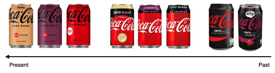
The aim of Coca-Cola’s controversial redesign of their Zero Sugar product range was to simplify and modernise the packaging design with flavour communication amplified (at the cost of “Coke red”) to support the launch of a new flavour-driven range.
The new packaging design is simple and modern but brand recognition has been sacrificed at the altar of flavour. There is also the notable loss of brand equity colours, red and white, as well as the disappearance of the well-known swoosh. You’ll see there’s been a gradual stripping back of the visual identity over time.
The watch outs
So what should you watch out for if you are considering simplifying and modernising your own brand’s packaging design?
1. Show the love
If you have an artisanal or heritage brand, be careful not to strip away valuable assets. Artisanal brands need a certain amount of craft and detail in the design to show the love and care that goes into the making of the product. A heritage brand must retain the character and story that reflect the bond loyal consumers have made with it over the years.
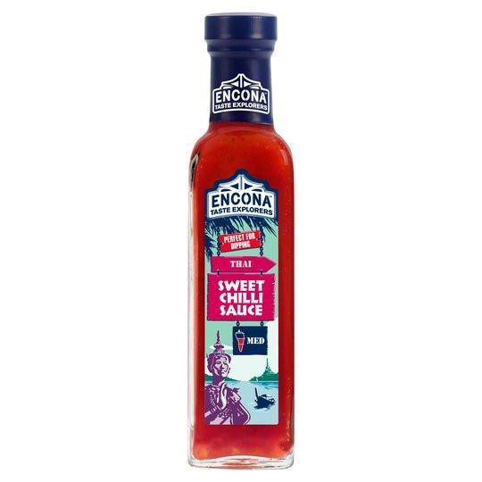
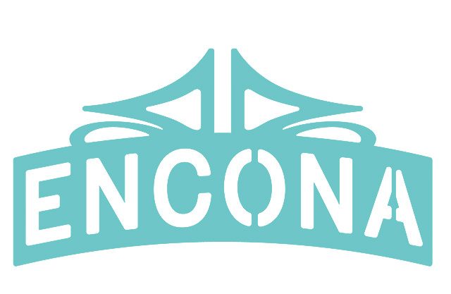
Our original design for Encona chilli sauce (left) has been stripped back by the current brand owners. Yes, the new design (right), is more simple but the engaging brand story (of exploring the world to find the hidden alleys where the best most authentic recipes can be found) has been completely lost. The consumer is now open to the temptation of buying a cheaper supermarket’s own-brand alternative.
2. Stand proud
Redesigning a brand identity that is already simple offers its own particular set of challenges. The importance here is to build on the visual assets the brand already owns to create a more modern packaging design.
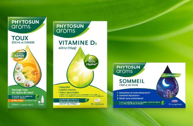
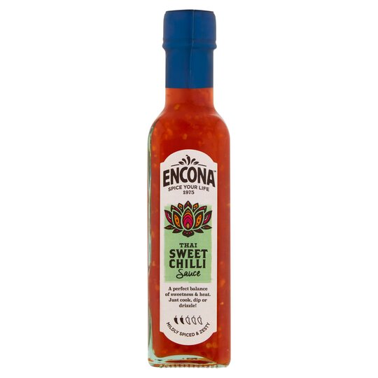
This is demonstrated in our recent redesign of Phytosun Arôms range of essential oils for Perrigo France. The new design on the right is just as simple (if not more simple) than the old design, but its design style is of today.
The visual asset of the oil droplet has been enhanced to create a key visual that is far stronger on-shelf and presents the brand as more confident and proud of its heritage.
You can see how we did the same for the Phytosun Arôms range of ready-to-use aromatherapy products in this case study.
3. Keep it emotional
A brand like Coke has advertising budgets most marketing directors would kill for. But the majority of marketeers need to rely on their brand’s presence on shelf to do most of the heavy lifting of brand building and creating that vital emotional connection with consumers.
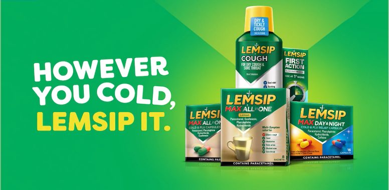
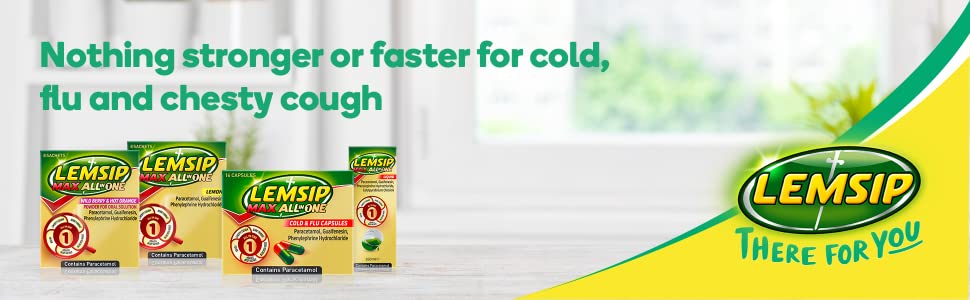
Lemsip’s foray into a more modern packaging design over the past few years is interesting. The brand team have decided to replace the emotional warming and engaging brand message the old packaging offered, with a stripped back simpler design. The new pack design now has plenty of space for clear messaging and claims, but has to rely on advertising for an emotional connection with consumers.
4. Be brave, but not too brave
Go too far and make a design too simple with no core message, and the identity will look old fashioned again within a year or two.
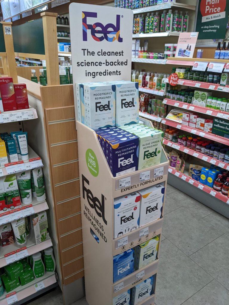
Packaging design doesn’t come much simpler than this lovely design from Feel. Being first to market with a design as simple as this can pay off. The brand name itself is memorable and emotional, and the message is clear. The only watch out is that the design is very easy to copy, particularly by direct to consumer online competitors.
I’ve laid out the argument here for modern packaging design that is simple.
I’ve given you some pointers on how to go about it. But what do you think? I’d love to know…..
And if you’d like to know more about creating valuable pack design read my next article here.