![]() By Caroline Hagen
By Caroline Hagen
We’ve all heard the statistic ‘80% of new FMCG product launches fail’ (urban myth or fact, you decide.) Whether you buy into the statistics or not, we can agree that the failure rate for new products is intimidating, even when you’re launching from a position of strength as an established brand.
So why do many launches fail – and what can you do to set off on a path for success from day one?
Let me paint a picture…
You have an established FMCG or healthcare brand; it might even be the category leader. However, your category is not growing and you need to deliver growth from somewhere fast. Your team have identified a category that’s in growth, and a gap in that category that you believe your brand is ideally placed to fill.
The NPD team have been briefed and you’ve developed a product with a co-packer that will enable you to get to market fast. They have a production line that you can run your ideal pack format down. Plus you have a hunch that your key customer will say yes to an exclusive launch listing. So all you need is to get the pack artwork done. Easy!
Well, it could be, and it should be easy. But all too often, all that excitement, enthusiasm, energy and sheer hard work does result in that listing – but leads to a de-listing a few short months later because the rate of sale just isn’t good enough.
So what might be going wrong?
Is it because the new product just isn’t as good as those that already exist? Product testing ought to have ironed this issue out – it shouldn’t get out of the development lab or kitchen unless it’s fit for purpose.
Is it because there simply isn’t the unmet consumer need in the category you thought existed? It’s possible that insufficient or inefficient market research has led to misplaced confidence. But as an already-successful business, it’s unlikely you’ll fall at this hurdle.
Or is it because, as a brand marketer, you were overconfident about the loyalty of your consumer to follow you into a new category? Did you stop to think hard enough about how to persuade loyal consumers that your new product is better than the one they are already happily purchasing from another, already-established brand?
…I think the reason for all too many failures is that marketers underestimate just how hard it is to get the pack artwork fit for purpose. Many brands rush to get to market fast and simply brief their packaging consultancy to adapt an existing pack identity, saving time in the short-term, but missing out on long-term growth and success.
So what’s wrong with just adapting an existing pack?
By diving straight in and modifying an existing pack, it’s all too easy to forget to analyse the new category from the consumers’ perspective.
What are the ‘way finders’ that consumers use in the category to find the product that they want or need? What are the unwritten ‘category rules’?
Important considerations include:
- Pack format – what’s the standard for this category? A bottle, a tetra, a carton, a multi-pack, a flow wrap?
- Flavour – are there particular colours used that consumers use as a quick shortcut to variety selection?
- Appetite appeal – does this come from brand design (graphics, colours, fonts) or depictions of the product (photographic or illustrative), or seeing the product through a window?
- Efficacy – pictograms of how the product works? Large written claims? Visuals of the benefit?
- Ethics – does the category have conditions for entry? For instance, should the product be organic, naturally made, from natural ingredients, small company feel, artisanal look… the list goes on.

It’s also important to explore which visual equities your brand has that need to be retained, adapted or even discarded to garner the credentials required to survive in this new category.
So where should you start to create a successful new pack?
Let’s take a look at the simple steps you can take to create pack artwork for your new product that’s both successful in the new category and faithful to your brand’s visual roots and consumer.
Step 1: design thinking
- Conduct a visual audit of the category – define the category rules and which are the critical ones the new pack artwork needs to adopt.
- Consider the brand’s visual equities and how they might adapt – get your design consultancy to create some visual prototypes that explore these.
You’re now well placed to create the visual strategy for the new product launch – this will determine how to find the right visual balance between brand recognition and the creation of category expertise.
Step 2: pack design
Now you can create pack design concepts that enable the consumer to recognise ‘their’ brand in a new category. Although the brand isn’t known as an expert in the new category, it still looks as though it has the right credentials to be there.
When it comes to judging the pack designs it’s really important to bear in mind that the new SKU will not ever be seen next to your brand’s other SKUs. They will sit on different shelves, so the design needs to work as hard as it can in its new category – perhaps even sacrificing some range design consistency along the way.
Let’s look at a couple of examples
A few years ago, when innocent moved from their heartland of smoothies into fresh orange juice, their first pack design was not a direct translation of their smoothie design.
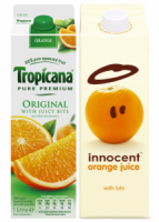
Although they had invented the new design trend in fruit drink packaging design with their trademark innocent simple line drawing for their smoothies – not an image of fruit in sight – they recognised that, as category king, Tropicana had ‘trained’ consumers to expect to see an image of juicy fruit on their front of pack. So innocent’s first foray into this commodity category showed an orange on-pack.
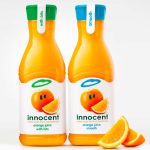
They have since evolved their design to include a juicier image of an orange and – since gaining a foothold in the category – introduced a bespoke designed PET bottle to justify a price premium.
I’ve learnt this lesson from experience…
New Covent Garden soup is the undoubted category king of fresh soups, having invented the category back in the late 80s. However, when we partnered with them to create their packaging design for a new range of pasta sauces, we didn’t get it right first time. They were confident that their loyal soup consumers would automatically buy the brand once it appeared in a new category – but this confidence was misplaced.
What went wrong? We launched the pasta sauces in New Covent Garden’s trademark tetrapak format – the packaging that had made the brand famous in soups. They had been first to market with a fresh soup, and the tetrapak format was synonymous with freshness.
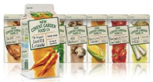
Understandably, the client team were convinced that their tetrapak format was an essential visual equity for the brand, so we took their steer and developed a pasta sauce tetrapak design.
The range launched, and unfortunately, the rate of sale didn’t live up to expectations.
Research was undertaken to find out what was happening and revealed a surprise: because consumers weren’t used to this pack-format in pasta sauces they weren’t even ‘seeing’ the pack on-shelf.
We quickly changed the pack format to a plastic tub – the unwritten rule of the category – and were instantly seen on shelf both as a pasta sauce, and a worthy competitor to the rest of the offer. The rate of sale soon climbed to a successful level.
So what’s the two-minute takeaway?
Don’t think it’s an easy step to take a brand that is successful in one category into another. Always take time to assess the brand’s visual identity and work out how to incorporate which of the new category’s visual rules you need to adopt in order to appeal to your loyal consumers in this new category.
By respecting the rules of the category you’re entering into – and never underestimating the research, planning and creativity it takes to make an impact – you’ll soon be on your way to a successful new launch.