
![]() By Caroline Hagen
By Caroline Hagen
Want to know what will help your household product packaging design really shine? We’ve got some great learnings based on our rebrand of the Wickes’ entire product range and bottom-line boosting work for Mr Sheen and Zeal. Our top tips to stand out? Focus on benefits; make it easy to differentiate between products in your range; and never forget print finish.
Consumer benefit vs product features
Why it matters?
Household products often have lots of features – lavender smell, kills germs, 5x faster – of which brand owners are rightly proud. These great features may have taken months or years of new product development to perfect. However, a fantastic feature doesn’t always explain WHY a shopper should buy a product.
When shoppers are scanning the shelves, they spend just a second or 2 deciding which household products end up in their trolley. That’s why quick and clear communication of ‘why to buy’ is essential, both within your range and vs. your competitors.
Reach & Mr Sheen – putting benefits front and centre
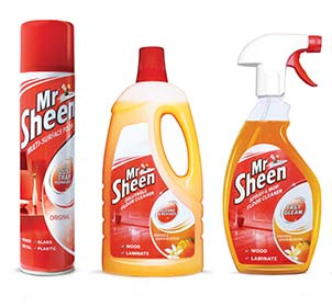
We helped Mr Sheen develop different single-minded claims for each product format: ‘cleans & revives’; ‘smear-free’; ‘fast gleam’; and ‘better dust pick up’. These claims help shoppers quickly understand the benefits of the different formats of aerosol, spray and wipe and choose the product best suited to their needs. Mr Sheen case study.
Enable easy range navigation
Why it matters?
Household goods ranges can comprise a choice of up to 100 products, so helping the consumer shop the range and get to the product that’s right for them is critical for successful packaging design. Pack format is key too because shoppers first scan the shelves looking for the shape of pack they need (an aerosol spray can vs a pack of wipes). Once they’ve identified the format they want, they’ll then look for a particular colour or fragrance.
Reach & Air Wick – instant range navigation
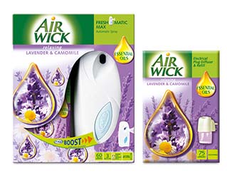
You can help them further by finding ways to visually segment the range. For the Air Wick range of room fragrances we created a distinct visual identity for their fresh contemporary range of Aqua Essence fragrances. This stood apart from the more traditional feel of their Essential Oils range. Consumers find this kind of visual direction helpful: it cuts in half the number of packs they have to scan to find the product they want. Air Wick case study.
Use print finish
Why it matters?
Print finish can be overlooked as a communication tool – but it can very effectively support a feature or a benefit. We buy with our conscious and our subconscious, so why waste an opportunity to stimulate your consumers’ senses?
In practice
We used a shiny print finish to make the Mr Sheen range look super shiny, reinforcing the benefit and emphasising their ownership of this benefit in the category. But shine is only half the story. For Wickes, a matt print finish replicated the finish of the paint, while adding a more premium feel. Read more about our entire store rebrand for Wickes.