Wickes – a strategy for success across 60,000 SKUs
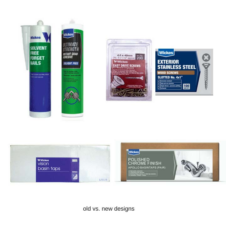
Wickes, a favourite of both the trade and savvy DIYers, sells only own-branded product in-store. The products are of excellent quality, but customers weren’t getting the message or finding items they needed. Reach stepped in, rebranding and redesigning the retail packaging identity – from tape to garden products to nails and screws – to great effect. Quant tests of the new paint packaging are indicative of performance across the range:
- 47% increase in perception of quality of the paint
- 25% increase in the perceived quality of the fixtures and displays
- 20% increase in the perceived range of paint available
Consumer perspective
Wickes faced a multi-faceted challenge. Though their own-brand products are of high quality, consumers weren’t getting the message. What’s more, significant staff cuts meant shoppers weren’t getting the help they needed in-store – and were walking out frustrated and empty handed as they struggled to self-serve across the range. Wickes realised it was time for a major overhaul of their retail packaging identity, and Reach was tasked with rethinking every product in store. From lights and tiles to screws and doors… this exciting household packaging design project covered over 60,000 SKUs.
Reach approach
Wickes has an unusual consumer profile. They attract the serious DIYer and the building trade. These shoppers don’t respond well to the more conventional ‘good/better/best’ ranging. Instead, they want products of the right quality to do the job at hand well – so we suggested organising product by the consumer’s needs when they enter the store. We identified 3 areas :
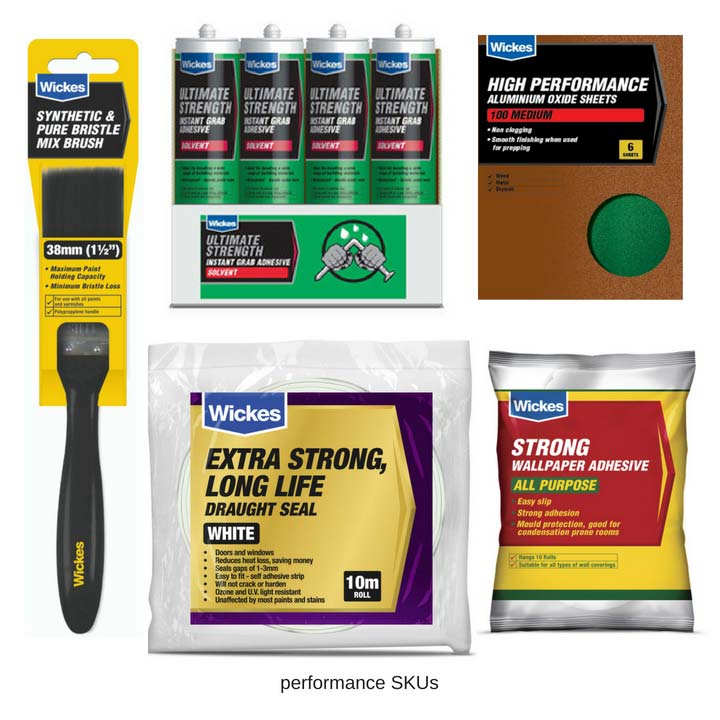
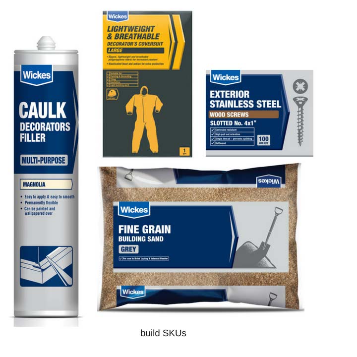
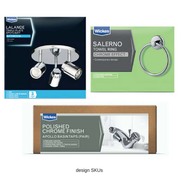
- Design products – such as doors, handles, lights, tiles, etc.
- Performance products – such as glue, tape, weedkiller, etc.
- Products used in building – such as nails, bricks, wood, cement, etc.
Alongside an innovative new ranging strategy, a key element of this retail packaging identity project was rethinking the logo. Now it takes a consistent position on all packs, giving the brand prominence and authority. Although it was designed for packaging, the business adopted the new logo as a new corporate identity across Wickes stores, TV advertising and all brand communication.
Secret to success?
Pushing for a brave retail packaging identity strategy. By working with the Wickes team and gaining their confidence, we were able to discard the usual retailer good/better/best segmentation within each product category, in favour of a consumer focussed shopper needs approach.
Reach delivers
A retail packaging identity that’s been adopted across the board, and a successful household packaging design project encompassing over 60,000 skus and a successful shopper needs driven strategy.
Reach thinks
Don’t always accept the status quo. If the rest of the market is adopting a particular approach, question whether it’s really right for your brand and your consumer. By being independently minded, you’re more likely to create a distinctive brand and a retail packaging identity that your consumer enjoys shopping.
For a retailer to package virtually every SKU in its business is a massive undertaking. It would be easy to focus on just getting through the project and accepting fit for purpose packaging design. What Reach have done is enable us to deliver pack designs of the highest quality, even by branded product standards, right across our business.
Reach has created a clear and very different visual strategy for our own brand that has enabled us to efficiently manage the repacking of over 60,000 SKUs whilst also positively affecting quality perceptions. We are really happy and they have become part of our team.