O’jos. Creating an authentic Chilean brand for a new usage occasion.
Summary
O’jos is a light and refreshing spritzer made from Chilean wine, and delicately flavoured with natural ingredients to enhance the taste.
Concha y Toro had identified an opportunity to broaden into new drinking occasions and make wine consumption more appealing to younger, super social consumers.
Reach created the brand positioning, brand identity and packaging design for the new drink that could appeal to these consumers.
Strong strategic thinkers and designers in an agency which brings a strong knowledge of the broader drinks industry. The agency considers the entire brand development process and offers a diverse range of services and skills outside of design to complement the design process.
Background
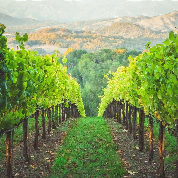
Concha y Toro is Chile’s largest producer of wines and is a global leader in its field.
They had uncovered an unmet need amongst millenial consumers and had created a new refreshing spritzer drink made from Chilean wine, sparkling water and delicately flavoured with natural ingredients to enhance the taste.
Knowing they needed an authentic brand to make the product attractive to these consumers, Reach was asked to take on the challenge to define the brand, its story and the packaging design to bring it all to life.
Challenge
We were tasked with creating a new global brand and packaging identity that:
- creates a new category between wine, fruit spritzers and RTD’s.
- appeals to Generation Treater consumer segment
- creates cut-through in the total alcohol market (on and off-trade).
- provides iconic brand equities which can be integral to comms.
These consumers are younger urbanites, they drink wine with friends and after work. Their choice of brand is driven by what it cues about them eg. sophisticated, educated, and they tend to choose familiar brands.
Our brief was to create a brand that felt instantly authentic, that was aspirational yet appropriate for an everyday light drinking occasion with friends.

Process
We developed several loose brand territories for our first working meeting with the Client; we shortlisted 3 to develop into fuller brand platforms with visuals and brand names. This enabled the Client to confidently select the final territory that beckons consumers to “join our tribe” with a personality that is urban Chilean, magical, colourful, inclusive and complex.
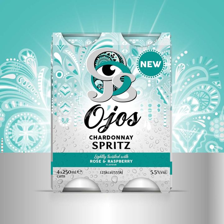
Once the Client came up with the name O’jos (inspired by a range of mountains in Chile), the brand story came easily:
The brand was inspired by the updated ritual of cheers, enjoyed by young Chileans (and others around the world) – it’s not a proper ‘cheers’ unless you look someone in the eyes when you say it – Ojos is Chilean/Spanish for eyes. This direct gaze reflects the spirit of togetherness created when good friends gather to enjoy good times.
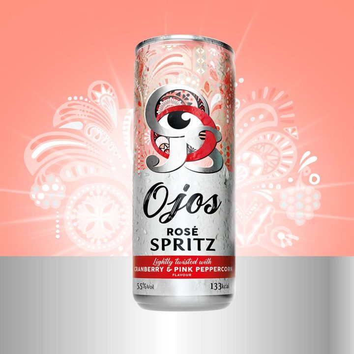
Design
The O’jos logo of course had to feature the eye – it is embedded at the heart of the design. The intertwining of the letters O J O S reflects the connectedness O’jos enables. Chilean tribal authenticity is reflected by the intricately illustrated background pattern. All of these are ownable assets that become visual shorthand for the brand and are brought to life in brand activation.
We used the silver of the can itself to enhance the sophistication and we selected an understated colour palette to ensure appeal amongst men and women.
Learning
Spend as much time as you can at the beginning of a brand creation project to develop the brand territory and story. This will smooth the way for the future trajectory of the project and the clarity provided makes life easier for everyone involved.
And certainly, don’t start the design process until you have a name that is approved by the business and available as a trademark.