Careful evolution of a highly successful Vitamin brand in Romania.
Summary
Vitamax is one of Romania’s most successful energy-boosting vitamin brands. However, the brand’s packaging had become out of date and the range identity was inconsistent.
Reach were tasked with evolving the packaging identity to establish a stronger brand identity and create a consistent look that could act as a design platform for any future NPD launches.
Background
Vitamax is owned by Perrigo, a leading provider of well known branded OTC self care products across Europe. They develop, manufacture and market brands in all the key OTC categories.
The Vitamax vitamins range had been on the market in Romania for 18 years, and is well-loved by consumers.
With lots of heritage to protect, Perrigo were rightly nervous about any packaging redesign; they were however confident that our hand-holding collaborative approach to such projects would enable them to safely explore how to best to evolve the brand identity.
Challenge
As with any brand that is as strong as Vitamax, Perrigo were keen to exploit its potential by extending into new geographic markets and by extending the range.
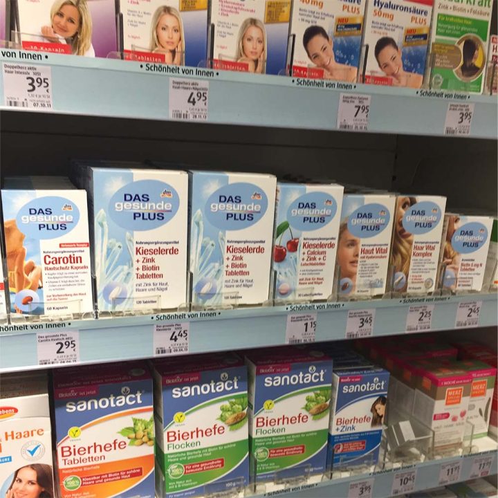
The Vitamins category is incredibly competitive and most products offer little or no differentiation. The claims that can be made are limited by strict regulations, so it is hard for a product to stand out and appeal to consumers using product information alone. A distinctive brand identity with strong shelf stand out is therefore key to success.
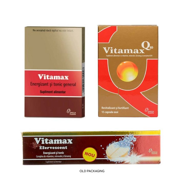
The Vitamax packaging identity had established some key colour cues that the brand ‘owned’ in the category – deep red and gold – that it was clear should be retained and strengthened.
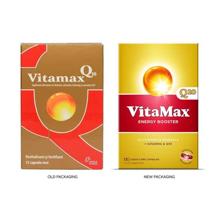
But what other visual equity could be created? The 2 SKUs, classic and Q10, had very different identities, so the key challenge was which identity should be the starting point? The stripes of the Classic pack or the Q and golden ball of the Q10 pack?
Process
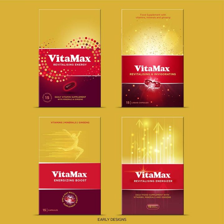
As well as using the stripes or the golden ball to build visual equity, the Client also wondered how the energy boosting proposition could be incorporated into the pack design.
Early design stages focussed on exploring various hypotheses around:
- how to use colour to create differentiation and build visual equity
- how the stripes could be used across both SKUs to build visual brand blocking on shelf
- could we visually communicate Energy?
Once the visual strategy had been agreed, the final design concept was then straightforward to achieve
Design
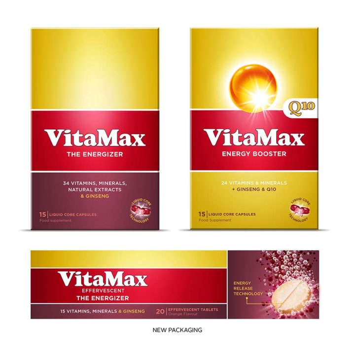
- Strong visual cohesion has been created by making the Classic stripes the core design across the range, and therefore bringing Q10 much closer in design to Classic
- The golden ball of Q10 has been retained to aid recognition but also updated to appear more powerful and eye-catching
- Product names – The Energiser and Energy Booster – have been introduced to enhance product understanding
- Product information has been standardised across the 3 SKUs to help consumers choose the right product
Learning
When faced with 2 packs as visually different in a range as Q10 and Classic, it’s a challenge to see where to start from to build similarity and strong visual identity for the brand.
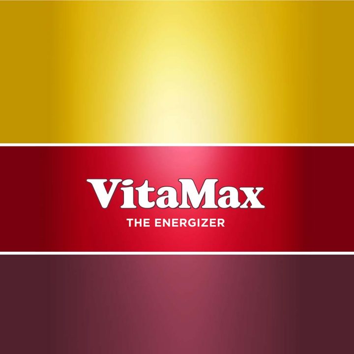
We chose to build on the emphatic stripes of Classic that can act as an anchor point for future NPD launches and also as a visual differentiator in the category.

