A baby brother for Bronchostop. A brand extension story.
Summary
Bronchostop’s natural formula makes it ideal for an extension into the children’s cough medicine category.
As we had created the identity for the Bronchostop, Perrigo turned to Reach create an identity that would be true to the parent brand but display the slightly less serious characteristics of the children’s category.
Working with Reach is very enjoyable.
The creative process is very smooth, from the brief right through to the delivery of the print ready artwork.
They do not hesitate to look for examples in other categories.
The whole team listens, but are always ready to share their point of view in order to obtain the best result of impactful packaging.
Background
Perrigo are experts in efficacious medicines that are made of natural ingredients.
The lifeblood of any brand is launching NPD that consumers need and for which there is a gap in the market; launching Bronchostop Junior was therefore a no brainer.
As Perrigo’s branding and packaging consultancy of record, it was therefore a no brainer for Luc to ask us to create this new sub-brand.

Challenge
The key questions that this project needed to resolve were:
– how make it sufficiently clear that the product is for children and not adults, so as to make sure there could be no confusion for consumers in the home, and without undermining its perceived efficacy.
– what to call it, given the age suitability is from 1 year through to 12 years.
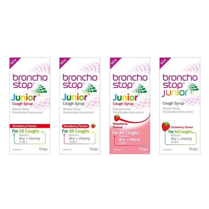
– how to introduce the strawberry flavour into the design.
Process
There are a number of ways the pack design could resolve the project objectives, so we opened up our thinking process to enable our client to get involved in the decision-making.
This entailed creating quick designs to visualise our various hypotheses.
Such as how to flag the flavour:
- how far up the hierarchy should it be?
- how much should it interrupt the design?
- do we need a visual of the strawberry?
Once these strategic questions have been answered, we were then able to proceed to the crafting of the final design solution.
Design
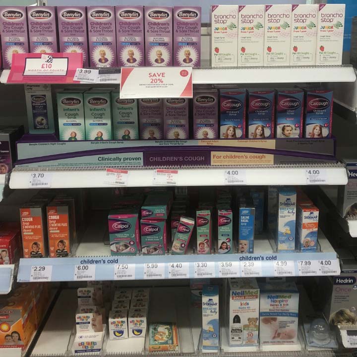
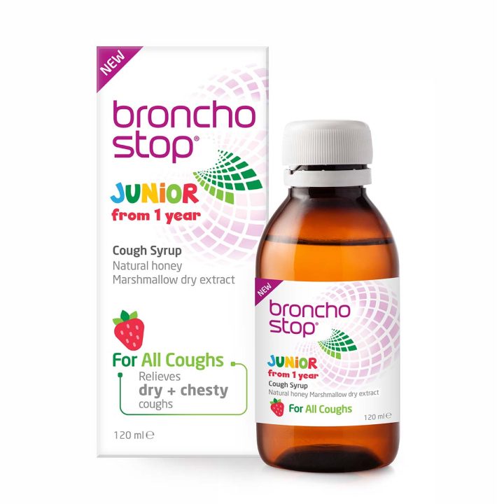
The final design solution creates clear differentiation from the adult syrup with its bright colours and sub-brand name, which also signal its child-suitable nature.
The font of the Junior logo and the illustration style of the strawberry create ownable brand assets by reflecting from the shapes of green ‘leaves’ in the Bronchostop spiral.
Sitting amongst other children’s cough syrups on the fixture, the Bronchostop identity will be instantly recognised by loyalists; equally the design is sufficiently disruptive to be spotted by consumers new to the bronchostop brand who are looking for an efficacious cough syrup for their child.
Learning
When an established brand enters a new category it’s important to balance the visual equity with the visual cues required to have credibility in the new category.
Take advantage of the opportunity to craft new visual equities for your brand that are ownable by your brand yet fit within the category.