Creating a children’s healthy fruit snacking brand for Disney
Summary
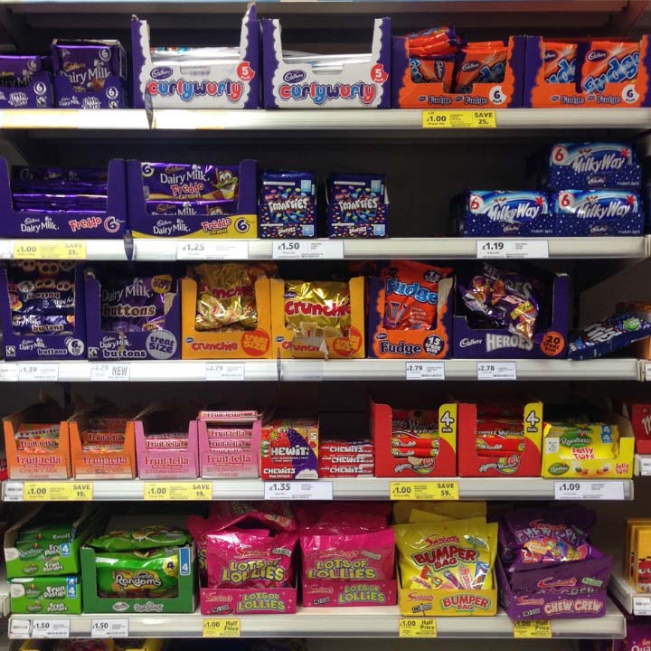
Bon Bon Buddies are Europe’s no.1 provider of character confectionary.
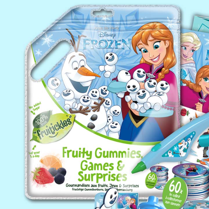
They had developed a new completely natural, all fruit, no added sugar sweet that they wanted to offer to Disney, one of their largest clients. The product needed its own brand in order to flag its healthy credentials to mum across different Disney character ranges and diverse pack formats.
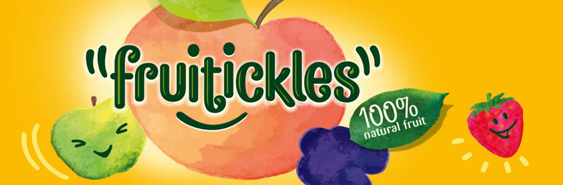
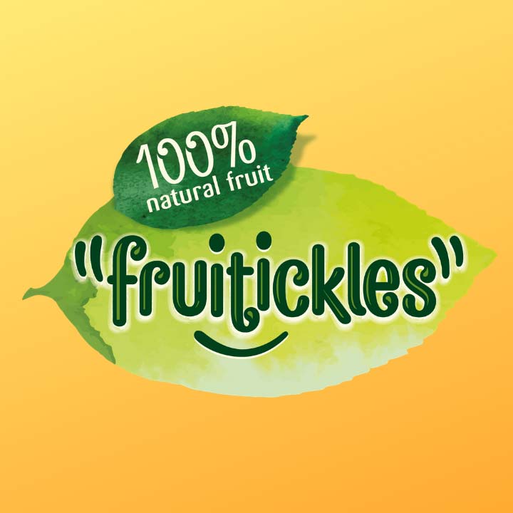
Reach created the Fruitickles brand name and identity for Bonbon Buddies to implement across a range of pack formats and character ranges.
Background
Bon Bon Buddies expertise lies in the development and manufacture of confectionary. Furthermore, they really understand the character confectionary market. They have an in-house design team who are working on the creation of packaging and point of sale for their clients such as Disney.
The team are experts in taking the brand assets of others to create packaging for character confectionary, however, they have no experience of creating their own brands.
Challenge
The new sweet was a very important innovation for Bonbon Buddies as it enabled them to target mums who are seeking healthier snacks for their children. Whilst mums are looking for healthy products, kids, of course, are looking for fun. However there were already plenty of fun sweets in the marketplace all masquerading with healthy/natural credentials.
So we needed to create a brand that was overtly healthy, also fun and could be juxtaposed with complex Disney character identities on pack.
Process
We were working to a small budget and a tight timeline so we needed to work very closely with the client, meeting frequently to ensure we were on track every step of the way.
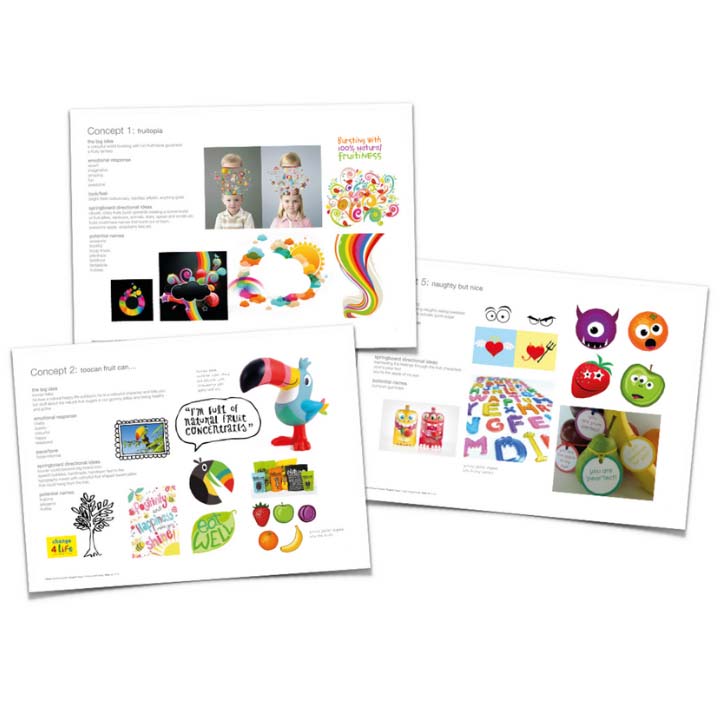
As our key client was a designer herself, we worked visually from the beginning and provided a range of quick concept boards from which a visual strategy could be selected to act as a springboard for the identity.
Design
The name represents the Fruitickle characters; a bunch of fruity (ie naughty!) characters that are always up to fun and games. The leaf (although cliched) gives a clear signal to mums that this is a healthy product; it’s also a useful holding device delivering brand impact on the usually crowded Disney character packs.
The colour palette has an earthy naturalness and the watercolour style of illustration creates an unprocessed fell to the brand.
Learnings when working on tight budgets.
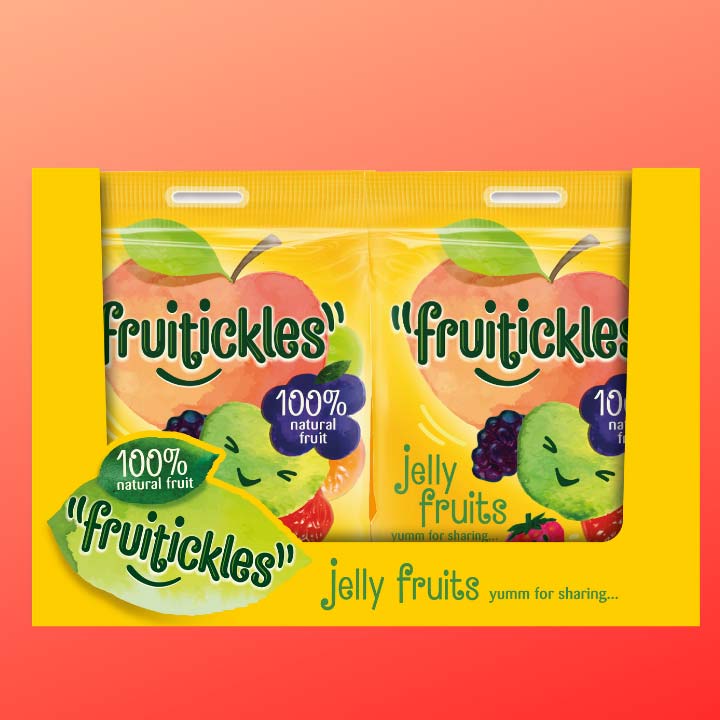
Even if there’s very little time and money available it’s always worth stretch testing a design to see how it might work in future scenarios. We did a quick design for a stand alone branded pack in its own SRP to check that, if the client wanted to launch the brand for themselves in the future, it had the potential for success
Always think ahead to how a design might need to work in the future.
