A packaging redesign to increase efficacy for Phytosun Arôms.
Summary
Phytosun Arôms (PSA) is a successful and thriving French brand owned by Perrigo. The brand is well known for the quality of its essential oils and offers ranges covering Ready to Use self care remedies, pure Essential Oils, pure Vegetable Oils and diffusers.
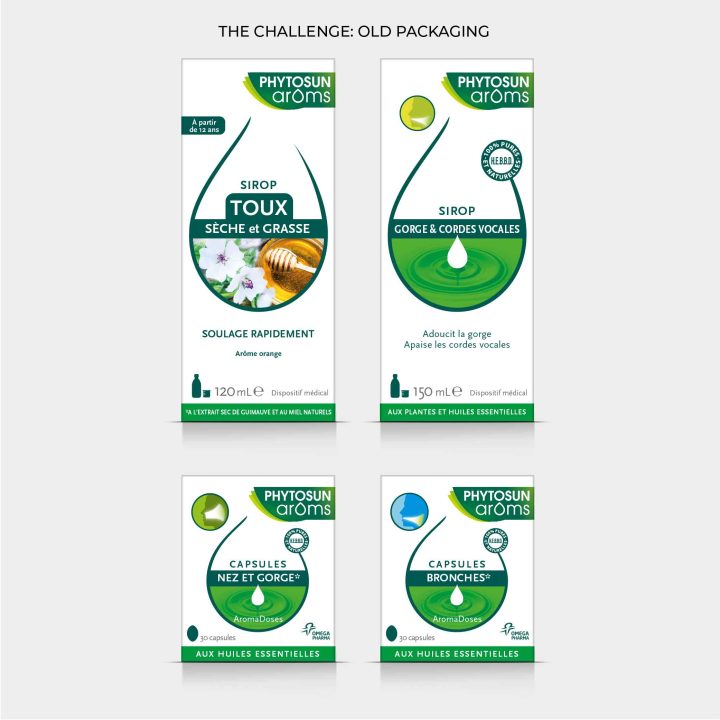
However, the packaging was looking out of date and the vast ranges lacked coherance, shelf impact and finding the right product was challenging for consumers.
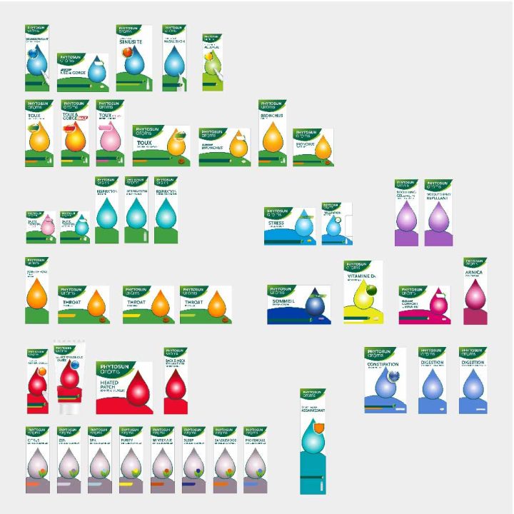
Reach have designed a new brand and packaging identity for the entire PSA range. We started with the Ready To Use (RTU) range that comprises 55 products offering self care solutions in a wide range of categories such as cough & cold, stress & sleep, joint care and digestion.
Working with Reach is a true partnership. They not only curate the graphic identity of our products but they truly understand the strategy of the brand. They always ask the right questions to ensure the best results.
Background
Perrigo offer consumers quality and affordable self-care products across Europe. Reach are a longstanding brand and packaging design partner to the central marketing team, however, we had never worked directly with the local marketing team in France. We were appointed to the project after a 2 way paid strategy and creative pitch against a Paris agency.
We won the pitch because the client was impressed by how enlightening and enjoyable our co-creation of the visual strategy was. Furthermore, unlike their experience of working with other agencies, our designers actually paid attention to this strategy and brought it to life creatively.
Challenge
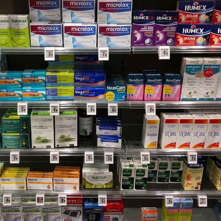
When the brand originally launched in 1992 its focus was solely on an aromatherapy essential oils range. The range has since expanded into the Ready To Use (RTU) category to compete with non-natural brands. These new Over The Counter (OTC) competitors often operate as expert brands within a single category and can also make stronger claims.
Perrigo’s aims for the brand and packaging identity redesign project were to:
- Reinforce brand awareness so that any promotional spend would be leveraged by an identity that is easily seen and recognised in pharmacy and online
- Bring the design more in line with OTC packaging without losing the brand’s heritage in aromatherapy
- Reinforce the brand’s natural, quality credentials and introduce efficacy
Process
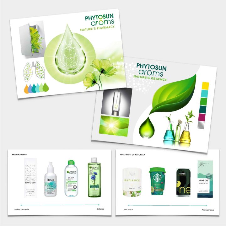
We kicked off the project with a workshop to co-create the visual strategy for the project. All key stakeholders attended this highly collaborative session.
We created visual stimulus that enabled the team to help us answer the following questions:
- How should the current PSA brand identity change
- How to articulate the PSA brand positioning in words and images
- What are the valuable visual equities to hold onto and build upon?
- What should the hierarchy of information be?
- How should the range be visually segmented?
- What OTC visual category cues should we adopt on the new PSA packaging?
This output was a creative brief that had key stakeholder buy-in. With all business needs considered from the outset, the project ran smoothly and efficiently. Agreeing the visual strategy upfront also ensured a well thought-out, effective pack architecture was established early on making it, an easy task to roll out the design across the many categories.
Design
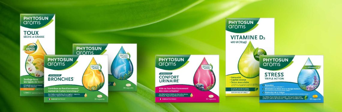
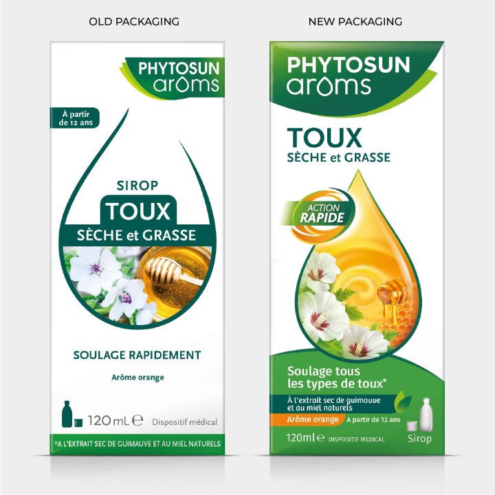
We have gently evolved the brand logo and holding device making it easier to use on- and off-pack. It now sits more comfortably on the left hand side of any communication.
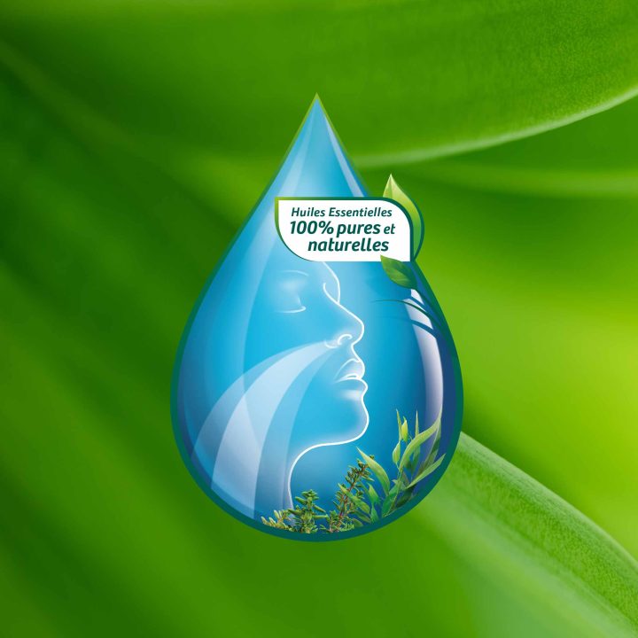
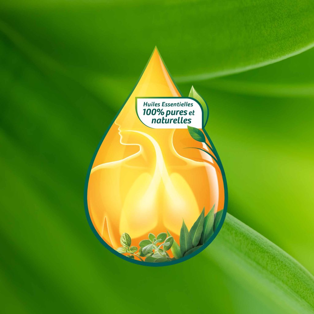
The central (oil) droplet on the old packaging has been evolved into a beautiful confident and stand out key visual. This is where the OTC category visual cues meet the natural world of PSA and more obviously infers the brand’s essential oils heritage and product formulation.
The hierarchy of communication is now consistent on all packs, which means consumers can compare and contrast packs easily to find the product that is right for their needs.
Colour and droplet design are used to create mini range identities on shelf without diluting the overall brand impact.
Learning
When working on an identity that will be rolled out across a large range of packaging, it’s important to stress test the design before it’s signed off.
Designing pack schematics of the range allows you to play with colour and graphics to see how best to organise the full range to help the consumer navigate the range.
It’s a very efficient way to create a vision for the roll out, pre-empt problems and ensure consistency.