![]() By Caroline Hagen
By Caroline Hagen
You’re a startup with an amazing product you absolutely believe in. You’re selling well locally and you’re on the verge of a listing in a major supermarket, which is a real turning point for your business. But you’re not totally confident with your pack design. Maybe a designer friend helped you out. You think it looks good and you’ve grown used to it but you’re not sure it will make the grade with WholeFoods.
So how do you decide whether you have a pack design that can work in the multiple supermarkets?
We’ve put together a checklist to help you decide if your pack can work commercially.
These are the key areas to think about:
- Is your brand mark strong enough?
- Communication on front of pack
- Pack format
- Stand out on shelf
- Imagery
Keep a note to see if you’re getting mostly YES or mostly NO answers to the questions
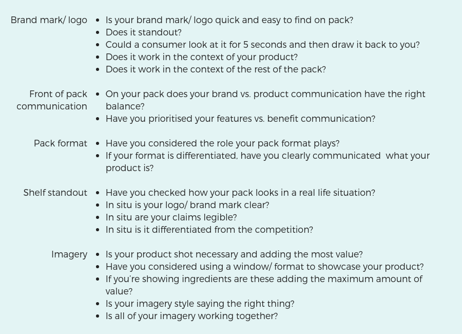
1. Your brand mark/ logo
Is your brand mark/ logo quick and easy to find on pack?
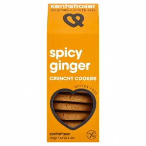
- Eg Top of pack seems like an obvious choice for your logo but is brand logo “KENT & FRASER” easy to find here?
Does it stand out?
- Eg You might have a beautifully intricate illustrated logo that looks incredible on your business card, but does it work when placed on a bottle with a label that’s only 3cm wide?
Is it unique and memorable?
- Could a consumer look at it for 5 seconds and then draw it back to you?
Does it work in the context of your product?
- Eg If you’re selling smooth velvety chocolate does an art deco angular style logo work?
Does it work in the context of the rest of the pack?
- Eg If your logo is an earthy brown and you’re printing directly onto brown board does that work as hard as it could?
2. Your front of pack communication
Shoppers spend only 3 or 4 seconds at a fixture deciding what they’re going to buy.
Are you saying the right thing at the right time and at the right volume? You need to attract the shopper with one key piece of information – this might be your brand or it might be your product. This one key thing will draw them in and get them to look at the other things your pack is communicating. If you are trying to communicate everything at the same time your consumer won’t bother to read anything
Ask yourself…
Does your brand vs. product communication have the right balance?
- The equation here is not straightforward. The shopper will need to know what you’re selling, but they will also need to know who they’re buying it from – your brand.
- Consider how your product is communicated in ways other than a product descriptor eg through pack format, imagery or merchandising. If these cues are strong perhaps you consider turning down product communication and upping brand.
- But bear in mind in 3 seconds the consumer will want to know exactly what they’re buying. If this isn’t clear enough they’ll become frustrated and there’s no chance they’ll pick you up.
Have you prioritised your benefits over your features?
- A consumer is going to be drawn to your product benefits over product features – what’s in it for them? “Contains real fruit” is great but perhaps “2 of your 5 a day ” is the more appealing message and should come first? Consider your messaging, what needs to be said first and if this beneficial for the shopper.
3. Pack Format
Pack format (bottle, cardboard carton, tetrapak) is one of the fundamental ways by which a consumer understands what your product is; each category in the supermarket will have a norm eg tea bags come in a cardboard carton with an open and closable lid. Pack format can be used in 2 ways: to communicate what type of product you are; if you are using a pack format that is unusual for your category, this will give you standout & differentiate your product in the category.
Have you considered the role your pack format plays?
-
Does an egg carton need to say “eggs’ on it. Of course not. Does a miniature <100ml bottle of shower gel need to say “travelsize” on it? no!
-
What are you saying on pack that your format is saying for you? Can you ditch this?
If your format is differentiated, have you clearly communicated what your product is?
-
An unusual pack format can be a great disrupter on shelf and really make you stand out but you need to make sure the consumer understands what your product is
-
Eg Iliada oil took no chances when they launched this oil in a small tin bottle rather than the the green glass bottles synonymous with the category.

4. Shelf Standout
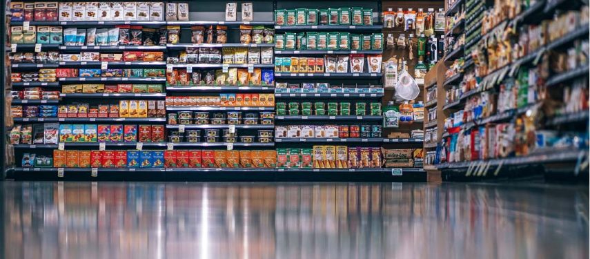
You always need to review your packaging in situ. What might look fantastic on your kitchen table might not fare so well when under the bright lights of the supermarket, merchandised on the bottom shelf and surrounded by competitors.
Have you checked how your pack looks in a real life situation?
- Part of our brief for Lyons Seafood was about ensuring the packaging would work in a freezer in the supermarket. was a key factor in choosing the strong blue colour that was used across both the chilled and frozen ranges.
In situ is your logo/ brand mark clear?
In situ are your claims legible?
In situ is it differentiated from the competition?
- Unless you’re truly the only product of your kind you will be fighting for a consumer to pick you up vs. the market leader. Being differentiated (for the right reasons) is key
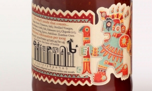
5. Imagery
Your pictures are as important as your words. The imagery is more than just the prettier bit of your pack, you need to consider.
Is your product shot necessary and adding the most value?
- Everyone knows what muesli looks like and chances are yours looks the same as the one sat next to it. Is there a different way to show this that would add more value?
Have you considered using a window/ format to showcase your product?
- If your product really is that good looking, why not show it?
If you’re showing ingredients are these adding the maximum amount of value?
- could they look more juicy, nutty, smooth etc.
Is your imagery style saying the right thing?
- Although it may feel on trend does an illustrated flower work as well as beautiful photography when selling gardening products? No. Part of our work on Solabiol was setting an imagery style and creating a library of beautiful imagery that could be used across the range.
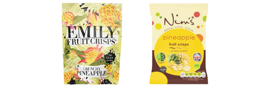
- But sometimes moving away from imagery styles that are more traditional can work wonders. Which of these crisps delivers more appetite appeal? Showing photographed real pineapple or illustrating the fruit?
Is all of your imagery working together?
- Even mandatory information and seemingly boring claims should be considered alongside your imagery style.
So, how did you do?
Mostly YESs – Great, you have probably worked with an experienced and expert packaging designer. Your pack meets the standard the multiple supermarkets are looking for.
Four or more NOs – Get help! Expert, professional help!
Your packaging is your key marketing tool; even with the most amazing product you are unlikely to gain listings without an effective pack design . And even when listed a shopper won’t pick up your pack unless it’s working really well.
Checklist of some questions to ask yourself