
![]() By Caroline Hagen
By Caroline Hagen
Shoppers spend only 3 or 4 seconds at a grocery fixture deciding what they’re going to buy or trying to find their favourite brand. If you don’t make it easy for them to find you with packaging that stands out amongst the crowd of your competition, you’ll lose out on a valuable sale. The easiest way to stand out is to be different; swim against the tide of bland, safe design that conforms to all the norms of your category.
For packaged goods brands with low marketing budgets, packaging is your key marketing and sales tool; it embodies your brand and gives consumers emotional and functional reasons why they should buy your product. And in the new digital era where online shopping is as big as bricks and mortar, it is just as important to have a pack that stands out from the crowd online too.
“The connected commerce era has arrived,” said Patrick Dodd, president, global retailer vertical, Nielsen. “Consumers are no longer shopping entirely online or offline; rather, they’re taking a blended approach, using whatever channel best suits their needs.”
Take the packaging test
Here’s a quick exercise to do on your own packaging to see if it passes the “I’m different and why” test.
Step 1
Look at your packaging either in situ on-shelf in your most important customer account or online grocery retailer such as Ocado; does your pack break any rules in your particular category by:
- using a unique colour?
- using illustration when everyone else uses photography? (or vice versa)
- having a simple/minimal graphic approach when others look busy? (or vice versa)
- having an unusual pack format?
- doing without a product or ingredients shot when others do? (or vice versa)
- telling an emotionally compelling story? e.g. a unique provenance, a unique methodology
- communicating a unique benefit? either functional or emotional
Step 2: the ultimate test
Ask someone (who isn’t familiar with your brand) to find your pack in a key account store by simply describing the packaging and NOT telling them the brand name. How easy is it to describe it? How easily can they find it?
The Benefits
If you do succeed in creating packaging that looks different in your category, you’ll benefit by:
Standing out on shelf clearly so that your loyal consumer can spot you quickly when scanning the shelves. If yours is the black pack, when most other players in the category use white, your pack will jump out for them. And new consumers may be distracted by your unusual packaging away from their usual brand.
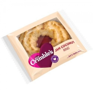
For example, in the “free from” category, many brands choose to follow the category norm of bland graphics in the hope that a product shot will provide the taste cues the consumer craves. Why not be bold, as Mrs Crimble’s have done, and choose to communicate taste using a vibrant brand mark whose shape and colouring denote taste and a passion for flavour.
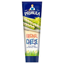
 In the cheese spreads chiller cabinet, Primula is still the only spread available in a tube. So not only does it look different, its shape makes finding it incredibly easy for loyal consumers to find quickly. An added benefit is its format also communicates how easy and waste-free it is to use.
If your packaging is different and also communicates why, you’ll benefit by:
The consumer being reassured that they have made the right choice of brand; after all, if they are parting with their cash, it’s nice to know why. If your pack underlines your brand’s unique emotional connection, in a category where most of the focus on pack is on product communication, your consumer will unwittingly be compelled to buy your pack.
Take coconut water… the vast majority of packs focus on the generic product benefit of purity and hydration; most brands choose to show pictures of fresh green coconuts with pure clean coconut water gushing out. Add to this the fact that the category has been inundated with new brands attracted by the trend towards natural low-in-sugar soft drinks. So the poor consumer is likely to be unfamiliar with the brands and is left wondering how to choose the one that’s right for them.
In this scenario, why wouldn’t you just choose the cheapest, as all packs are promising the same (generic product) benefit. The brand that is brave enough to choose an emotional (brand) reason on which to focus their visual imagery will therefore gain a competitive advantage.
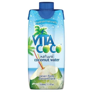
So instead of showing coconuts, CocoVita show images of a tropical landscape, and evoke a lifestyle the consumer subliminally steps into for a moment. They’re then hooked into the brand and prepared to pay a price premium because they connect with the brand.
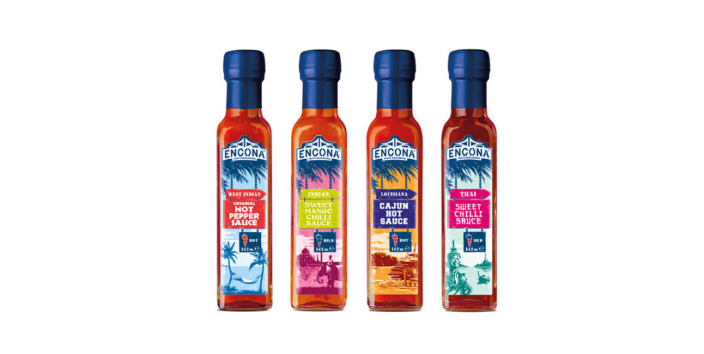
Our design for Encona hot pepper sauce takes the same approach: in a category that mainly features pictures of chilli peppers on the packaging, the Encona packaging design stands out. It features the far flung exotic places the company travels to find the most authentic ingredients – that is the reason why they their product is the best in the category.
Unique packaging design can also influence the supermarket buyer to list your brand or new product. They are consumers after all; they will also be more persuaded by your claim of difference and newness if you are confident enough to reflect this in a pack design that creates difference in the category.
So next time you need a new print run of your packaging, whether it’s just to update the ingredients list or to introduce a new claim, or you decide it’s time to update the design, take time to consider how you could improve your brand’s impact and appeal on shelf. If you decide to take a bigger step than you would normally take and resolve to create packaging design that really shows and supports how different your brand or product is, your consumer will most likely reward you with increased sales and the buyer in your key account may surprise you by granting you an extra facing or new listing.