Creation of the Bethlehem Cultural Festival branding
Summary
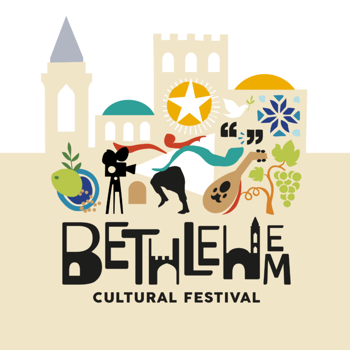
The Bethlehem Cultural Festival is a virtual celebration of the town’s rich and diverse cultural scene through music, film, cookery, dance and discussion. Reach created the festival branding comprising the logo word marque and illustration, as well as the icons for each of the diverse aspects of the festival’s programme. Thus providing the visual framework for the website.
I knew from the moment I had the idea for a cultural festival for Bethlehem that branding would be key to its success.
Having no experience of creating a brand, I was a bit nervous, however Caroline and Sophie made the whole process enjoyable and clear. My partners in Palestine and I are delighted with the outcome.
Background
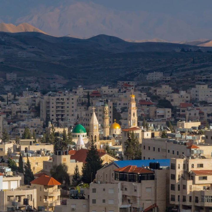
Frustrated by the frequent misunderstanding that Bethlehem is in the Occupied Palestinian Territories and not in Israel, and driven by a desire to shine a light on the cultural brilliance of the people of Bethlehem, Melissa Scott alighted on the idea of a cultural festival.
Caroline and Melissa had originally met in Bethlehem, at the Alrowwad Cultural Centre in the Aida refugee camp. So Reach was the obvious partner to create the festival branding.
Challenge
Being a virtual event, the festival branding would only appear digitally in 2020 (it will be a live event in future years) so we had to create a framework and visual assets for the website and social media.
We wanted to create a brand identity that would reflect the vibrancy of the inhabitants and city of Bethlehem, one that would bring the festival alive for prospective attendees, sponsors and press.
Unlike many other online festivals which generally have a single focus, such as film or talks, the Bethlehem Cultural Festival comprises talks, films, theatre and dance performances, singing, cookery demonstrations and discussions. It was therefore important to emphasise each diverse cultural aspect of the festival.
Process
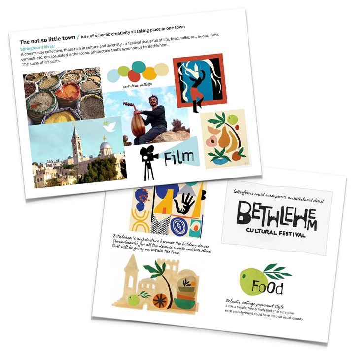
It’s always important to agree a strategic direction for festival branding before diving into design. We researched the city of Bethlehem, seeking out imagery that represented the architecture and the lives of its Palestinian inhabitants. This inspired 3 distinct propositions, which we expressed in words and visuals.
Sharing these with Melissa and her Palestinian partners, helped them focus and agree on the key message for the festival, making the design process from then on enjoyable and straightforward.
Design
Our brand identity captures the architecture and skyline of the not so little town of Bethlehem. It’s built on hills, so the higgledy-piggledy nature of its buildings are cleverly reflected in the word marque. And if you look closely, you’ll see the tiny door to the Church of the Nativity (Jesus’ birthplace) in the B of Bethlehem.
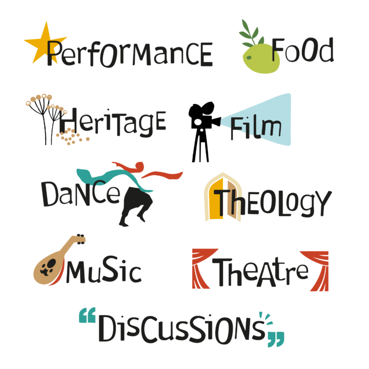
Lively icons represent the diverse nature of the festival programme and are used in the website to help participants decide which events to attend.

