Enhancing the purity and simplicity of a range of essential oils
Summary
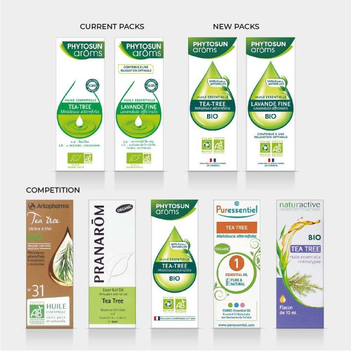
Phytosun Arôms range of essential oils are one of the highest quality ranges available in France, however the packaging identity was undermining this benefit. The Perrigo team wanted to improve the look and feel of the packaging without losing any of their loyal consumers.
Reach have carefully updated the design identity to create a beautiful modernised range of packaging whose synergy gives it strong shelf impact.
Reach have managed to capture the quality of our Essential Oils in this design that is creating strong impact for the brand on shelf. They are true design partners; guiding us, and also challenging us when necessary. I’m pleased to report that the response to the new design from our sales team and pharmacists has been very encouraging.
Background
Phytosun Arôms (PSA) is a well known French brand that comprises a vast range of aromatherapy products.
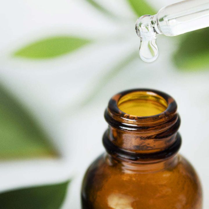
Its 100% pure and natural Essential Oils range is at the heart of the brand offer.
These are concentrated extracts of plants that can be used as natural and alternative ways to improve health. They smell divine and inhaling them can have huge benefits mind and body.
Challenge
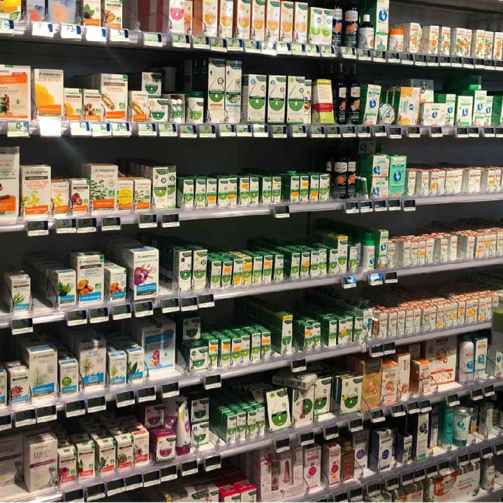
The appeal of these products is in their natural simplicity, as such all brands of essential oils packaging design follow a simple formula. Each of the 3 leading brands have large ranges and product differentiation on pack is achieved through text only, rather than bespoke plant imagery.
The new modernised design for the PSA Essential Oils range therefore needed to retain this simplicity whilst improving the impression of quality, purity and naturalness.
The new identity also needed to form a cohesive part of the full PSA Aromatherapy product range in order to leverage brand blocking opportunities in pharmacies.
Process
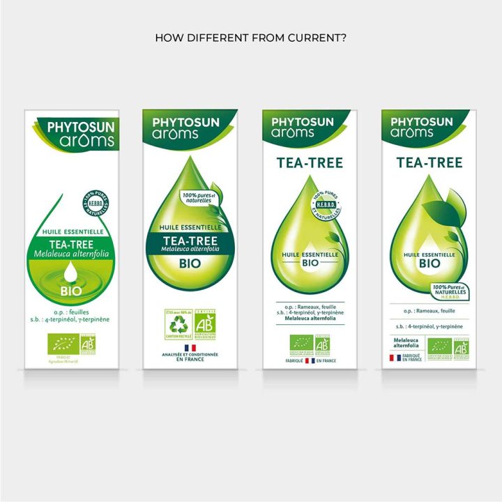
There are always strategic questions to answer before starting to redesign a packaging identity. So we developed stimulus for a co-creation workshop with the client team to enable us to collectively answer questions such as:
- How different should the new design be from the current identity?
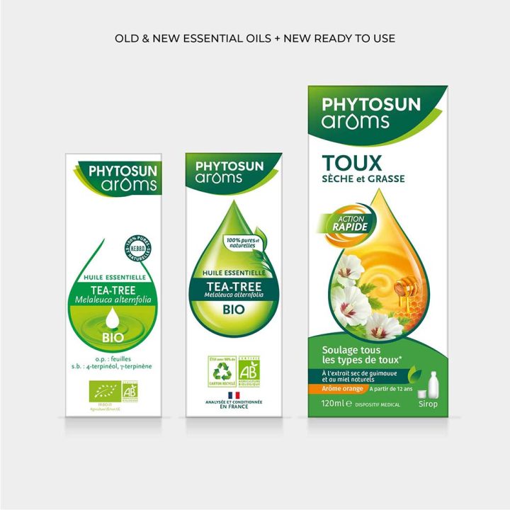
- What aspects of the Ready-to-Use range identity should we use?
- What should the front of pack hierarchy of communication be?
- How much visual differentiation does each product need?
The Solution
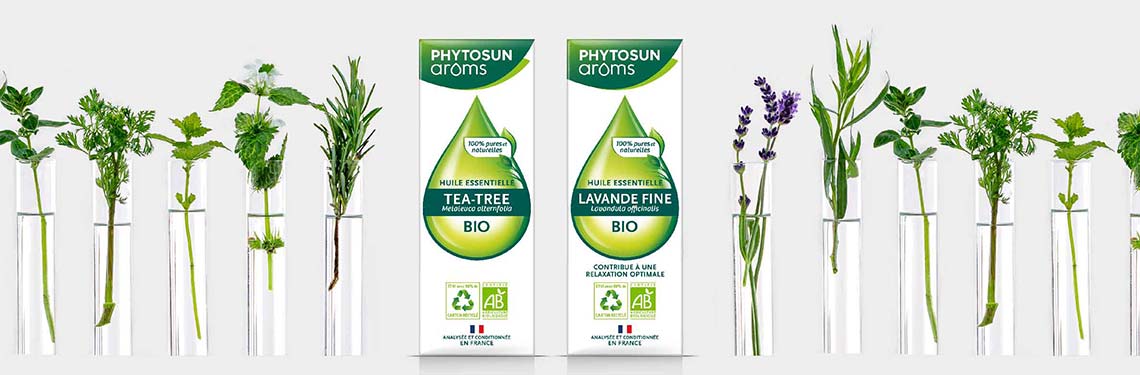
The PSA Essential Oils range now had a beautifully simple pack design. Each features the PSA droplet representing the purity of the oil and building on the droplet icon established for the brand in our design for the ready-to-use range identity.
Naturalness is emphasised by the leaf fronds emerging from the oil droplet, drawing the eye to the 100% claim.
The product names are now more legible against a deep green band that also aids product differentiation.
The design works in harmony with the rest of the PSA ranges, holistically bringing the packs and brand together to create one clear consumer offering.
Learning
When working on on a packaging design project, make sure you consider the designs in context at every stage of the process. For example, show:
- designs next to the old packs to check consumer recognition
- 2 SKUs side by side to check consumers can differentiate products
- 1 SKU lined up against the competitors to check standout, uniqueness and fit with the category