Packaging with appetite appeal for the launch of a new lifestyle sub-brand
Summary
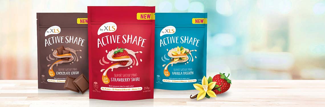
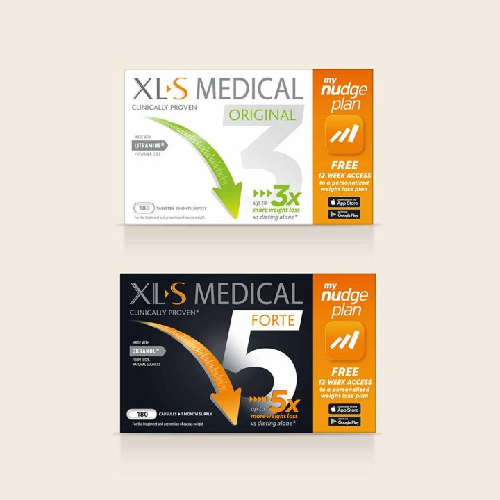
The XLS Medical brand encompasses a highly successful range of weight loss products sold across Europe. Perrigo had a new range of weight loss milk shakes to launch under the brand and asked Reach to help position the range within the overall portfolio and create the brand and packaging identity to support this positioning.
I appreciate the way Reach clearly explain the reasons why a particular packaging design meets my brief. This helps me learn and also gives me confidence when sharing their designs with stakeholders. I can recommend them as a great partner for big packaging redesign projects for roll out across European markets.
Background
Working with the central category marketing team, we had already designed the identity for several XLS Medical ranges, so knew the brand well. However, this new range was different to the medically positioned range of tablets the brand already offered.
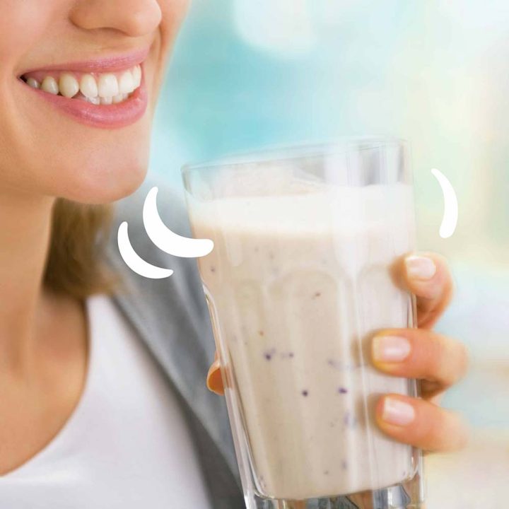
The milkshakes are a range of lifestyle products, offering a tasty replacement to a meal, with the reassuring weight loss efficacy the XLS brand brings with it.
Challenge
There were 2 key challenges to this project:
- how to position a lifestyle range under the umbrella of the serious medical positioning of XLS Medical in a way that appeals to a younger demographic
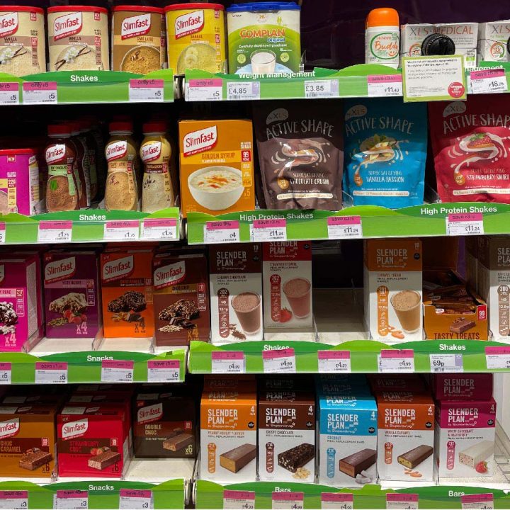
- how to create appetite appeal within the regulatory restrictions: it is not possible to show realistic representations of ingredients. Consumers don’t want to compromise too much on taste by replacing a standard meal with an Active Shape shake
Furthermore, not being first to market in this category, meant it was important to adopt some of the visual cues already established in consumers’ minds.
Process
The strategic phase of the project entailed creating visual stimulus exploring the various hypotheses in response to the following questions :
- How much colour? – appetite appeal vs standout against competitors
- How to visually engage younger consumers?
- How far to stray from the XLS Medical identity?
- What should the pack hierarchy be?
- How to generate appetite appeal?
Creating hypothetic visuals that answered these questions allowed us to run a workshop with the client team to collaboratively generate the design strategy.
Outcome
The final design
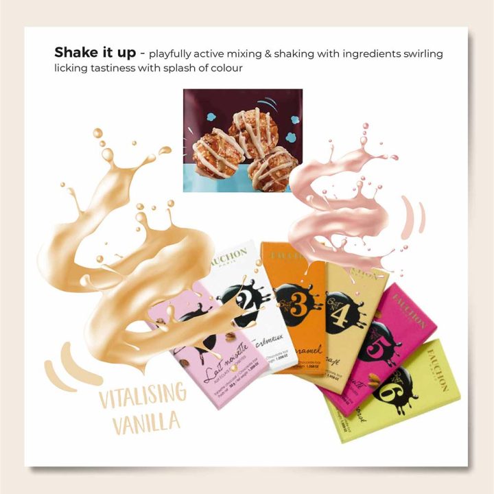
- Appeals to younger consumers with a lifestyle proposition that’s unique in the category: swirling milk suggests goodness and energy
- Has strong shelf impact yet fits comfortably within the category – bold colours provide strong colour coding to promote the range of flavours available
- These full colours suggest food with plenty of taste and adopt the colours the wider food category use for each flavour, again reassuring consumers they are not missing out on a standard meal
And it overcomes regulatory rules that don’t allow photography of ingredients by using bespoke illustrations to provide appetite appeal and evoke real food.
Learning
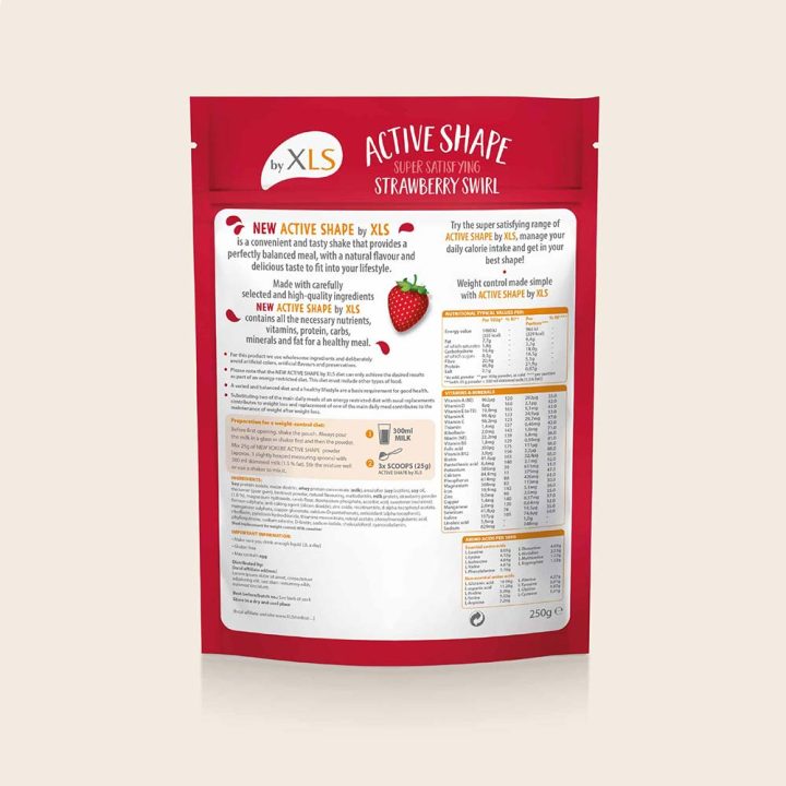
Spend time and effort on back of pack design
It obviously needs to carry important information but can also be used to evoke the brand positioning. Make the most of assets created on front of pack to build consumer engagement.
A well designed back of pack adds value to the product; thoughtful design subliminally signals product quality and care to consumers.
Regulatory challenges can become opportunities to create valuable brand assets
Using real photography of the key flavour ingredients is usually used to help consumers believe that the product doesn’t compromise on the flavour of a standard milkshake. In fact, we used bespoke illustrations to achieve this, which allowed us to create a more distinct visual identity for the range.