![]() By Caroline Hagen
By Caroline Hagen
Building consumer loyalty is a key objective in any FMCG brand manager’s brand plan. However, using unique packaging as a powerful tool to achieve this is often overlooked.
Every time a consumer buys your product and they like it, they will want to repurchase; so you want to make sure you make it as easy as possible for them to do so. They will need to recognise your brand quickly and easily when they’re next shopping. If your brand identity is too generic to the category and not sufficiently distinctive, the danger is that your about-to-be-loyal consumer will not spot your product quickly enough and buy a competitor brand’s product instead.
Unique packaging is also important if you are investing in any form of advertising. If you’re featuring a pack in an ad, you want to be sure that there are visual attributes that consumers can latch on to and recognise when they see your product when shopping either instore or online.
If your brand or product has a unique proposition, you want to be sure you retain ownership of this attribute, whether it be emotional or functional. Translating this into a feature of your packaging is a sure way of hanging on to that. The trick lies in balancing the uniqueness of your brand identity with product identifiers that help the consumer select which product in your range is right for them.
So how confident are you that your brand’s packaging is unique?
If you’re not sure, visit your fixture in the supermarket or convenience store, or do a quick Google search check to see how unique your brand is and how well it stands out against its product competitors:
- Is its pack format unique?
-
Does the pack have a distinctive logo or graphic icon?
-
Is the predominant pack colour unique in the category?
-
Is its USP communicated on pack?
Let’s put some packs to the test.
Here’s a selection of wine spritzer brands all available in cans – how unique is each pack?
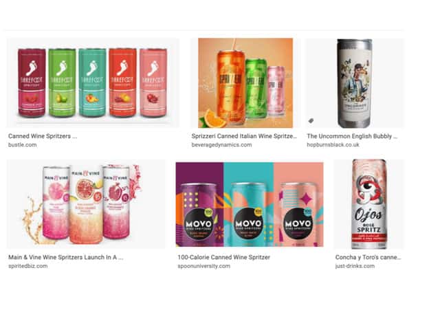
- Pack Format: they are all in the same can shape, so no distinction there.
- 3 have unique graphic icons: Barefoot’s foot, The Uncommon’s animal characters and O’jos’ eye
- None have a distinctive colour; actually in this category colour is often reserved for flavour differentiation, so there’s no opportunity for distinction in this way
- And 3 have a USP communicated visually; Barefoot’s foot symbolises the brand’s footloose and fancy-free personality; The Uncommon’s eccentric animal characters reflect the product’s English provenance and O’jos’ name and authentic Chilean graphic background pattern symbolise the brand’s urban Chilean roots
The problem with the other 3 brands’ pack designs is that there are no visual assets that the brand can attach to; they are either meaningless shapes that any other brand could copy (Movo) or generic product attributes such as ingredient visuals or bubbles (Main & Vine and Sprizzeri).
Maybe it’s time to consider whether your pack design is sufficiently differentiated in its category?
If you decide you need to revisit your pack design, you might find some helpful guidance in these 2 case studies.
You also might find this blog post helpful … how to create valuable pack design